

svelte-zukan
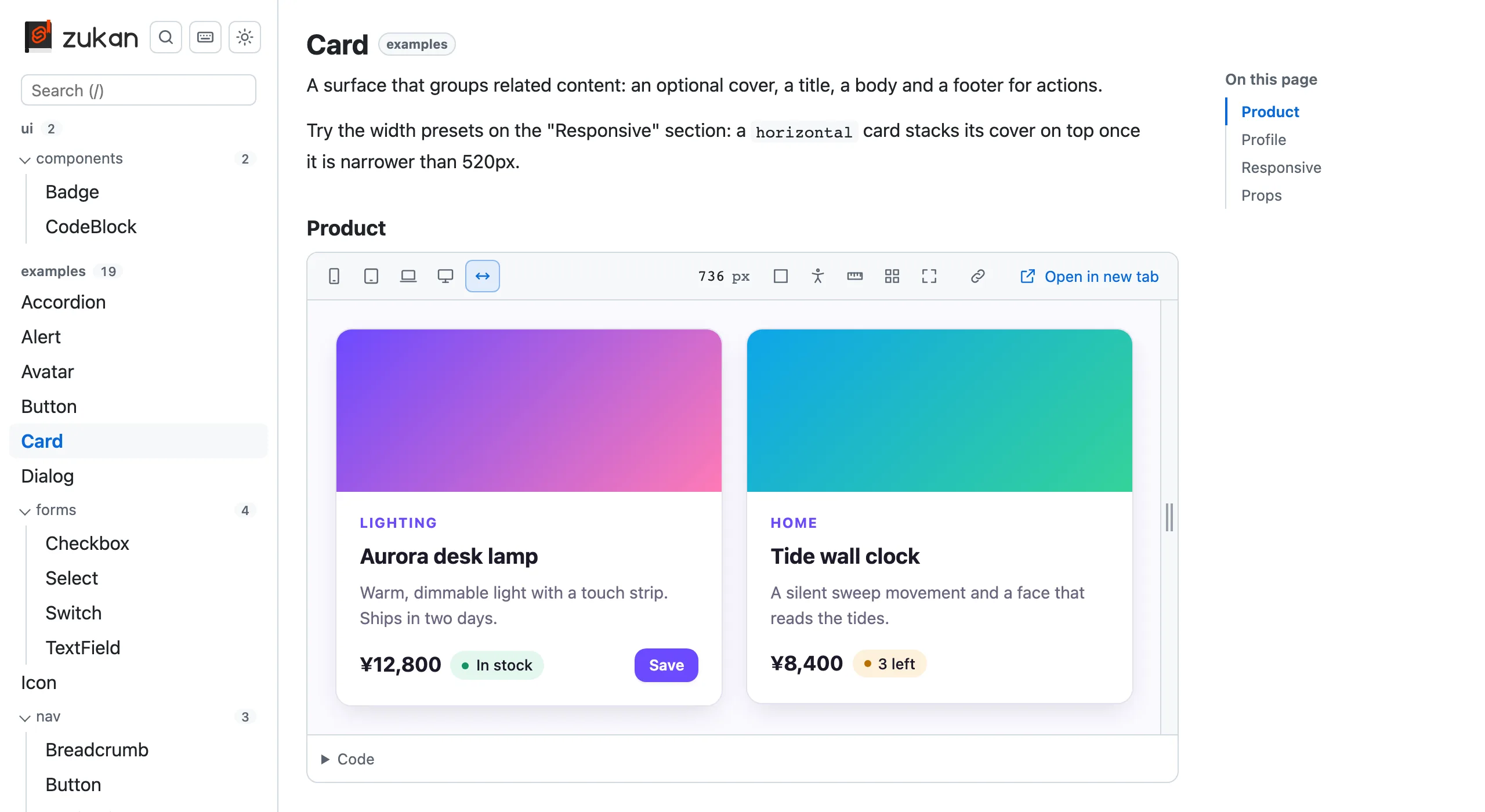
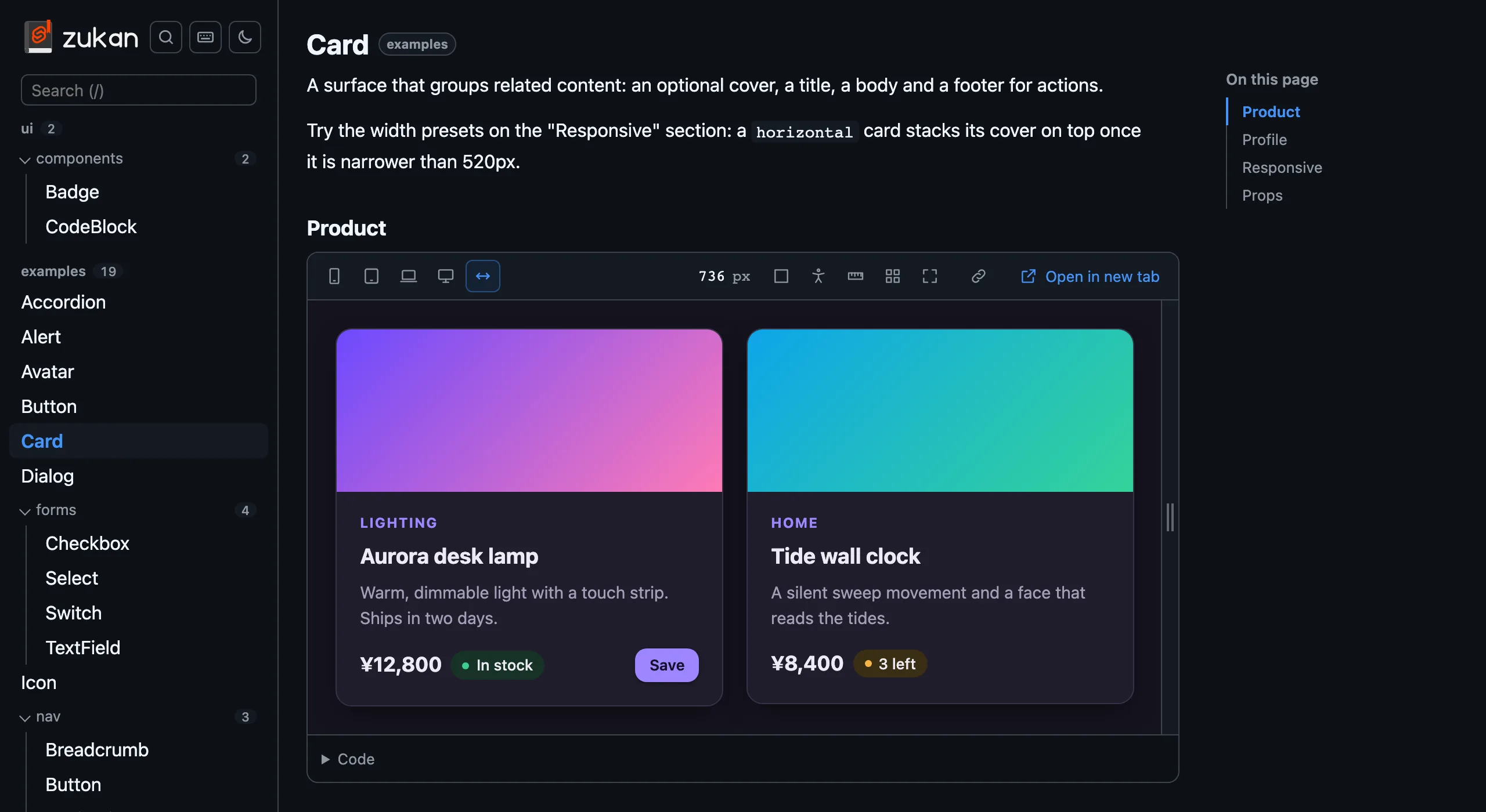
A component catalog for Svelte. Put a catalog file next to a component and you get a list, a live preview, and a code view.
“zukan” (図鑑) is Japanese for “illustrated encyclopedia”.
One line in vite.config.ts
Add zukan() to your Vite plugins. No routes or config files in src.
Next to your components
Put Button.zukan.svelte and Button.zukan.md next to Button.svelte and they show up in the catalog.
Preview and code
Each section previews in a resizable iframe, and its code is shown with the variables it uses.
Props and accessibility
A props table read from the component, and axe-core checks with outlined issues and vision simulation.
Phone to desktop widths
Presets from 375px to 1280px. Narrow widths are centered, wide ones scaled to fit your screen.
Static export
With build: true, vite build also writes a static catalog that works under any subpath.
Let your AI agent write the catalog
Install the agent skills and ask Claude Code, Cursor, Codex or another agent to “set up svelte-zukan and catalog our components”. It adds the plugin with the options your project needs, writes a catalog file for each component, documents its props with JSDoc and a .zukan.md file, and checks the result.
npx skills add oekazuma/svelte-zukanGet started
Install svelte-zukan and write your first catalog file.
Why svelte-zukan
What it focuses on, how it compares with Storybook, and when Storybook is the better pick.
See the demo
The catalog of svelte-zukan’s own components, exported with build: true.
View on GitHub
Browse the source, open issues, and contribute.
svelte-zukan is not an official Svelte project (not affiliated with or endorsed by the Svelte team). The S shape in the logo is derived from the Svelte logo.