---
title: Preview toolbar
sidebar:
order: 3
---
Each section previews in its own frame, with a toolbar above it. The frame is the catalog page itself, on the same origin. The dev server sends the catalog page with `server.headers`, except that `X-Frame-Options: DENY` becomes `SAMEORIGIN` and a Content-Security-Policy `frame-ancestors` also allows `'self'`, so the frames can load.
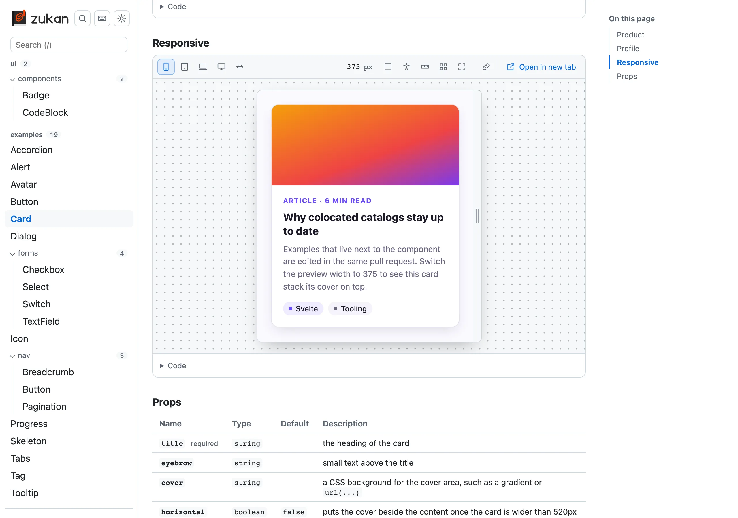
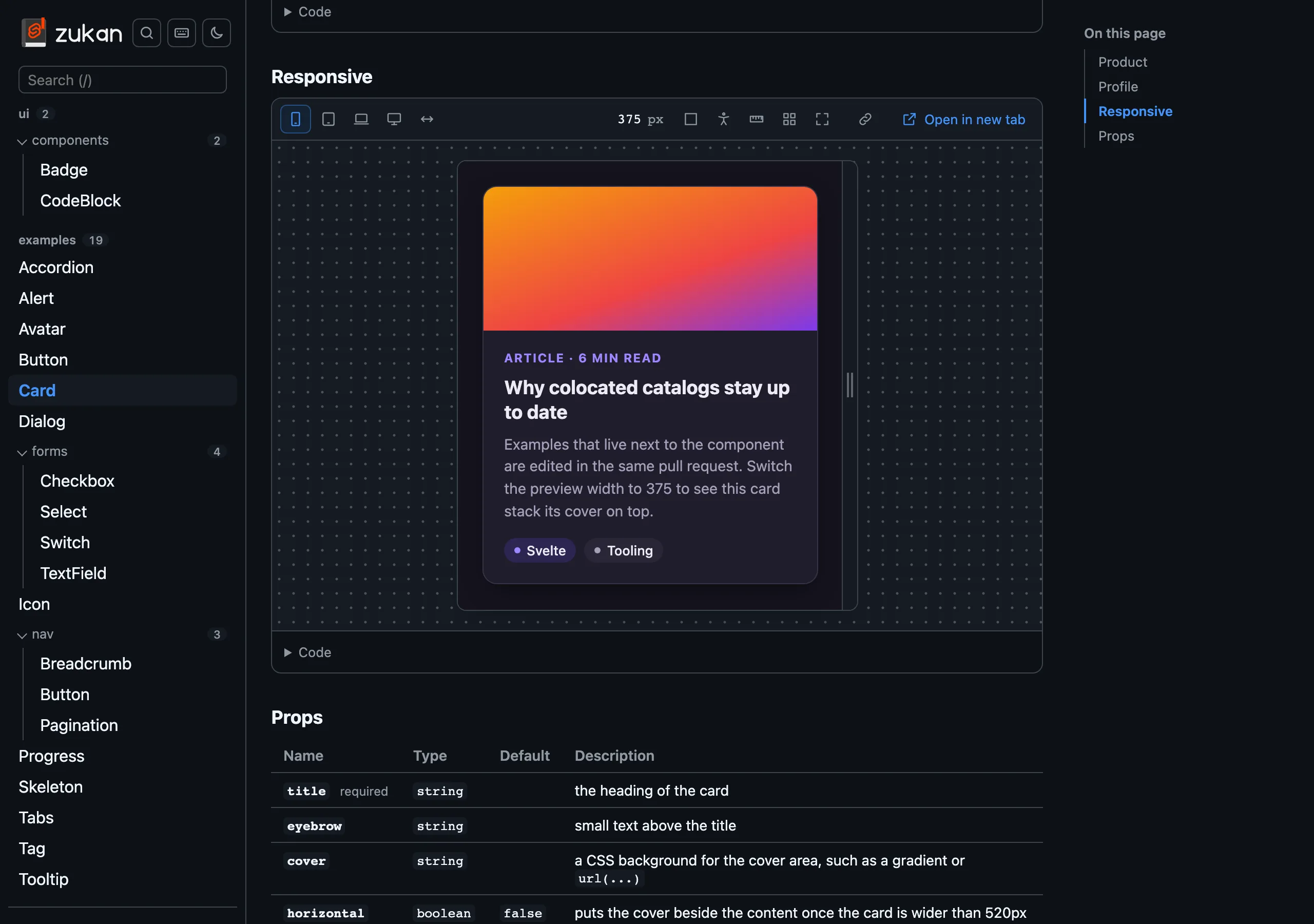 ## Width
- The presets are a phone (375px), a tablet (768px), a laptop (1024px), a desktop (1280px) and the full width. You can also drag the grip on the right edge, or type a width in pixels into the number next to the presets
- A width narrower than the page is centered on a dotted background, so the device's edges stay visible on a wide screen
- A width wider than the page, such as the desktop preset on a laptop, is laid out at its real width and scaled down to fit. The scale is shown next to the width
- Widths are remembered in this browser tab across reloads, so a preview keeps its width while you edit
## Height
A preview is as tall as its content in normal flow. Content in the top layer or with `position: fixed` or `absolute`, such as a modal, a popover or a menu, adds no height, so it can be clipped. Give the section's content a `min-height` that leaves room for it, or use Expand.
Content sized to the preview's own height, such as `min-height: 100vh`, has no height of its own to follow, so the preview keeps the height it first measured. Use Expand to see it at the window's height.
## Other buttons
| Button | What it does |
| --------------- | ------------------------------------------------------------------------------------------------------------------------------------------ |
| Background | Switches the preview's background between the theme's color, a checkerboard (to see transparency) and a grid, in every preview on the page |
| Accessibility | Opens the [accessibility panel](/svelte-zukan/accessibility) |
| Measure | On hover, shows the element's size and draws its margin, border and padding in the colors of browser dev tools |
| Outline | Outlines every element of the preview |
| Expand | Fills the window with the preview. Esc or a click outside leaves |
| Copy link | Copies a link to this section at its current width and theme |
| Open in new tab | Opens the preview alone, in the catalog's theme |
A copied link opens the section with its width and theme. The theme applies to that tab only, so it does not replace the theme you chose. You can also write such a link by hand: add `width` and `theme` after `section`, as in `#/ui/Card?section=Basic&width=375&theme=dark`. `width=full` opens the preview at full width. When the [`theme` option](/svelte-zukan/options) fixes the theme, a link's `theme` is ignored.
A preview opened in a new tab gets the theme as its `color-scheme` too, but it has no frame around it, so `prefers-color-scheme` there follows the browser, not the theme.