# svelte-zukan
> A component catalog for Svelte, served by a Vite plugin.
# svelte-zukan
Source: https://oekazuma.github.io/svelte-zukan
"zukan" (図鑑) is Japanese for "illustrated encyclopedia".
**One line in vite.config.ts**
Add `zukan()` to your Vite plugins. No routes or config files in `src`.
**Next to your components**
Put `Button.zukan.svelte` and `Button.zukan.md` next to `Button.svelte` and they show up in the catalog.
**Preview and code**
Each section previews in a resizable iframe, and its code is shown with the variables it uses.
**Props and accessibility**
A props table read from the component, and axe-core checks with outlined issues and vision simulation.
**Phone to desktop widths**
Presets from 375px to 1280px. Narrow widths are centered, wide ones scaled to fit your screen.
**Static export**
With `build: true`, `vite build` also writes a static catalog that works under any subpath.
## Let your AI agent write the catalog
Install the [agent skills](/svelte-zukan/skills) and ask Claude Code, Cursor, Codex or another agent to "set up svelte-zukan and catalog our components". It adds the plugin with the options your project needs, writes a catalog file for each component, documents its props with JSDoc and a `.zukan.md` file, and checks the result.
```sh
npx skills add oekazuma/svelte-zukan
```
**[Get started](/svelte-zukan/quickstart)**
Install svelte-zukan and write your first catalog file.
**[Why svelte-zukan](/svelte-zukan/why)**
What it focuses on, how it compares with Storybook, and when Storybook is the better pick.
**[See the demo](https://oekazuma.github.io/svelte-zukan/demo/)**
The catalog of svelte-zukan's own components, exported with `build: true`.
**[View on GitHub](https://github.com/oekazuma/svelte-zukan)**
Browse the source, open issues, and contribute.
svelte-zukan is not an official Svelte project (not affiliated with or endorsed by the Svelte team). The S shape in the logo is derived from the Svelte logo.
---
# Accessibility panel
Source: https://oekazuma.github.io/svelte-zukan/accessibility
The accessibility button runs [axe-core](https://github.com/dequelabs/axe-core) inside the preview and lists what it reports: the impact, a description, a link to learn more, and the elements involved.
- The reported elements are outlined in the preview in the color of their impact. Hover or focus an element in the list to draw it thicker, or click it to keep it that way and scroll to it. An element inside a shadow root is listed as its host's selector, `>>>`, then its selector inside
- What axe-core cannot decide on its own, such as the contrast of text over an image or a gradient, is listed separately under "Needs a manual check" and outlined with a dashed line. Read about each rule (Learn more) and check it yourself: some are visual, such as contrast, and some are not, such as an ARIA attribute. When nothing else is found, the panel says so instead of reporting no issues
- The check runs again after each edit while the panel is open, whether the preview reloads or the edit is applied in place, and after a theme switch or a width change
- "Simulate vision" shows the preview as seen with blurred vision or a color vision deficiency (protanopia, deuteranopia, tritanopia, achromatopsia). Each chip shows a sample of its colors
- "Check" has two switches for what axe-core cannot see:
- "Text 200%" doubles the root font size of the preview, as raising the browser's default font size does, so text that overflows or overlaps shows up. Text with a fixed `px` size does not grow, which is worth fixing too ([WCAG 1.4.4](https://www.w3.org/WAI/WCAG22/Understanding/resize-text.html))
- "Tab order" numbers the elements the Tab key moves to, in that order, and numbers them again when the preview changes. Elements inside a shadow root or an iframe are left out
- The vision simulation and both switches go back to off when the panel closes or the preview reloads
- With `locale: 'ja'`, axe-core's messages are in Japanese too
- A section that fails to load, or whose component throws while rendering, is reported as the error instead of being checked
axe-core is loaded only when a check runs, as a script file of the catalog (`/__zukan/axe.js` on the dev server, a file under `_zukan/` in the [static export](/svelte-zukan/static-export)), so a Content-Security-Policy of `script-src 'self'` allows it. The rule about landmarks around all page content is off, since a component on its own has none.
---
# Using it with AI agents
Source: https://oekazuma.github.io/svelte-zukan/ai-agents
An AI coding agent can set up svelte-zukan, write catalog files and check them without a browser. The quickest way to get there is the [agent skills](/svelte-zukan/skills). svelte-zukan also gives an agent these docs as text and the catalog as data (also as WebMCP tools in the browser).
## The skills
svelte-zukan ships two agent skills: `svelte-zukan`, to set svelte-zukan up and to write, document and check catalog files, and `migrate-svelte-zukan`, to move a catalog from Storybook or Histoire. [Agent skills](/svelte-zukan/skills) describes each one and how to install them.
## The docs as text
- [`llms.txt`](https://oekazuma.github.io/svelte-zukan/llms.txt) lists the pages, and [`llms-full.txt`](https://oekazuma.github.io/svelte-zukan/llms-full.txt) has all of them in one file
- Every page is also available as Markdown: add `.md` to its URL, as in `https://oekazuma.github.io/svelte-zukan/quickstart.md`
## The catalog as data
The dev server serves `/__zukan/catalog.json`, and `vite build` with `build: true` writes the same data to `catalog.json` next to `index.html`. Paths in it are relative to Vite's root. When the catalog can not be listed (a duplicate ID), the dev server answers with status 500 and `{ "error": "" }`.
| Field | What it holds |
| ------------------------- | --------------------------------------------------------------------------------------------------------------------------------------------------------------------------------- |
| `title` | The [`title` option](/svelte-zukan/options) |
| `components[].id` | The [catalog ID](/svelte-zukan/catalog-ids) |
| `components[].group` | The group: a `groups` key, or the package's `name` |
| `components[].name` | The catalog file's name without `.zukan.svelte` |
| `components[].dir` | The part of the ID between the group and `name`, or `''` |
| `components[].file` | The catalog file |
| `components[].component` | `Button.svelte` next to `Button.zukan.svelte`, or `null` |
| `components[].doc` | The `.md` file as Markdown, or `null` |
| `components[].props` | The [props table](/svelte-zukan/catalog-files#props-table): name, type, default, required, bindable, description (HTML) |
| `components[].propsType` | The props types from a package, or ones the table cannot read, as written in the source and separated by commas; otherwise `null` |
| `components[].sections[]` | Each section's `title`, its `code` as the code view shows it, and `preview`, the hash of its preview page |
| `components[].error` | Set when the catalog file is not plain Svelte markup or breaks a [`` rule](/svelte-zukan/catalog-files#sections), with the message of that build error; its `sections` are then empty |
| `uncataloged[]` | `.svelte` files in the scanned directories with no catalog file next to them, leaving out the same files as the [top page](/svelte-zukan/catalog-ui#top-page) |
| `tailwind` | `null` when no [Tailwind CSS entry](/svelte-zukan/tailwind) was found (or Tailwind is missing or v3), else one object per entry, described below |
Each `tailwind` object has:
| Field | What it holds |
| -------------- | --------------------------------------------------------------------------------------------------------------------------------------------------------------------- |
| `file` | The entry, relative to Vite's root |
| `version` | The Tailwind CSS version |
| `prefix` | The `prefix` of the theme, or `null` |
| `categories[]` | The utility classes by category: `id`, `title`, and `tokens[]` with `class` (with the prefix; `null` for a breakpoint or the spacing base), `cssVariable` and `value` |
| `variables` | Every theme variable and its value, as `{ "--color-brand-500": "#ff3e00" }` |
| `error` | Set when the entry could not be loaded, with the message; `categories` and `variables` are then empty |
The classes in `categories` are the ones the theme defines, so an agent that styles a component should use only those. Dark-mode values, arbitrary values and variants are [not part of it](/svelte-zukan/tailwind#what-it-does-not-show).
`preview` is a hash on the catalog page: `/__zukan/#/preview/ui/Button?section=Primary` shows only that section, so it is a good page for a screenshot. Add `&theme=dark` for the dark theme, unless the [`theme` option](/svelte-zukan/options) fixes it. It sets the page's `color-scheme`, which `light-dark()` follows; a stylesheet that uses `prefers-color-scheme` follows the browser, so a screenshot in dark also needs the color scheme emulated (in Playwright, `colorScheme: 'dark'`). The page fills the window, so set the window's width for a phone or tablet layout.
## WebMCP tools in the catalog
In a browser that implements [WebMCP](https://webmachinelearning.github.io/webmcp/), the catalog page also offers its data as tools, so an agent driving the browser does not have to read the screen:
| Tool | What it does |
| ---------------------- | ------------------------------------------------------------------------------------------------------------------------------------------------------------------------------------------------------------------------------------------------------------------------------------------------------------------------------------------------------------------------------------------------- |
| `list_components` | Lists the components (ID, name, group, section titles, the first line of each description) and the uncataloged files |
| `get_component` | Returns one component as `catalog.json` has it |
| `open_component` | Shows a component's page, optionally at a section, with that section's preview at a width and in a theme |
| `check_accessibility` | Renders one section on its own and returns axe-core's violations (`violations`) and what it could not decide on its own (`review`) |
| `list_tailwind_tokens` | With Tailwind CSS data only. Without a `category`, lists each entry's categories and their token counts. With one of the category IDs (`background-color`, `padding`, `font-size`, …), returns its tokens, and with `full-config`, every theme variable as `{ variable: value }` under `variables` instead of `tokens`. `query` keeps the tokens whose class, variable or value contains the text |
Browsers without WebMCP ignore them, and nothing is loaded for them.
---
# Catalog files
Source: https://oekazuma.github.io/svelte-zukan/catalog-files
Put `.zukan.svelte` next to the component. `.zukan.md` is optional. No dedicated directory such as `zukan/` is needed. File names are matched case-sensitively on every platform, so `Button.Zukan.svelte` is not a catalog file, and `Button.Zukan.md` and `button.svelte` do not belong to `Button.zukan.svelte`.
```text
src/lib/Button/
├── Button.svelte
├── Button.zukan.svelte
└── Button.zukan.md
```
## Sections
A catalog file is a Svelte component made of `` blocks. Each section is one example, previewed on its own.
```svelte
```
- Put `` at the top level, not inside another element or block
- `title` must be a non-empty static string, unique within the file
- Write the markup and `
```
The props are read from the component's source, not by running it. The type can be written inline, or as a type alias or interface declared in the component (an interface's `extends` included). It can be on the destructuring or on `$props()` itself (`let { a } = $props() as Props`, or with `satisfies`). A prop declared twice, such as an interface narrowing a member of the one it extends, is listed once, as the interface itself declares it; an interface declared twice in one file has the members of both declarations. A type imported by a relative path is read too: from a `.ts` or `.d.ts` file (`./types`, `./types.js`, `./types/index.ts`, `./types/index.d.ts`, with its `export … from` re-exports and names exported under another name, as in `export { Inner as Props }`), from a `.svelte.ts` module (`./state.svelte`) or from another component's `
```
- `` はトップレベル(他の要素やブロックの中ではない位置)に置きます
- `title` は空でない静的な文字列で、同じファイル内で重複できません
- マークアップと `
```
props はコンポーネントを実行せず、ソースを読んで取り出します。型はその場に書いても、コンポーネント内で宣言した type エイリアスや interface(interface の `extends` を含む)でもかまいません。型を書く場所は、分割代入でも `$props()` 自体(`let { a } = $props() as Props`、または `satisfies`)でもかまいません。interface が `extends` した型のメンバーを絞り込んだときのように、同じ名前の prop が 2 回宣言されていれば、その interface 自身の宣言で 1 行だけ並びます。1 つのファイルで 2 回宣言した interface は、両方の宣言のメンバーが並びます。相対パスで import した型も読みます。`.ts` や `.d.ts` のファイル(`./types`、`./types.js`、`./types/index.ts`、`./types/index.d.ts`。`export … from` による再エクスポートや、`export { Inner as Props }` のように別の名前で export した型も含む)、`.svelte.ts` のモジュール(`./state.svelte`)、ほかのコンポーネントの `
```
## カタログを開く
dev サーバーを起動して `/__zukan/` を開きます。起動時にターミナルへ出る URL 一覧にも、カタログの URL が載ります。
Vite の `base` や SvelteKit の `paths.base` を設定しているときは、カタログはその下に移ります。`base: '/app/'` でも `paths.base: '/app'` でも `/app/__zukan/` です。
トップページには、すべてのコンポーネントが小さなプレビュー付きで並びます。詳細ページには、各セクションのプレビューと、幅・背景・計測・アクセシビリティ検査のツールバー、各セクションのコード、コンポーネントの props が並びます。どれも[カタログの使い方](/svelte-zukan/ja/catalog-ui)でキーボードショートカットとあわせて説明しています。
## 次のステップ
**[カタログの使い方](/svelte-zukan/ja/catalog-ui)**
プレビューのツールバー、アクセシビリティパネル、検索、キーボードショートカット。
**[カタログファイル](/svelte-zukan/ja/catalog-files)**
`` のルール、Markdown の説明、コード表示に出るもの。
**[設定](/svelte-zukan/ja/options)**
`zukan()` のすべてのオプション。
**[エージェントスキル](/svelte-zukan/ja/skills)**
Claude Code、Cursor、Codex に、導入、カタログファイルの作成、Storybook からの移行を任せる。
---
# エージェントスキル
Source: https://oekazuma.github.io/svelte-zukan/ja/skills
svelte-zukan には、Claude Code、Cursor、Codex などの AI コーディングエージェント向けに、2 つの [Agent Skills](https://agentskills.io) が付いています。スキルはエージェントに svelte-zukan の使い方を教えるものです。ふだんの言葉で頼むだけで、このドキュメントに沿ったカタログができます。
| スキル | 使う場面 |
| ----------------------------------------------- | -------------------------------------------------------------------------------------- |
| [`svelte-zukan`](#svelte-zukan) | プロジェクトに svelte-zukan を導入し、カタログファイルを書いて、説明を付けて、確かめる |
| [`migrate-svelte-zukan`](#migrate-svelte-zukan) | Storybook や Histoire からカタログを移す |
エージェントは頼まれた内容に合うスキルを自分で選ぶので、スキル名を指定する必要はありません。
## インストール
[skills CLI](https://github.com/vercel-labs/skills) でインストールします。
```sh
npx skills add oekazuma/svelte-zukan
```
CLI がどのスキルを、どのエージェントに入れるかを尋ね、プロジェクト内のそれぞれのエージェントのスキルのディレクトリに置きます。質問を省くには、スキルを `--skill` で(例: `--skill svelte-zukan`)、エージェントを `-a` で(例: `-a claude-code`)指定します。`-g` を付けると、すべてのプロジェクトで使えるように入ります。
npm のパッケージにも同じスキルが `node_modules/svelte-zukan/skills/` に入っていて、インストールしたバージョンに合っています。これを自分でエージェントのスキルのディレクトリにコピーして使うこともできます。
```sh
mkdir -p .claude/skills && cp -r node_modules/svelte-zukan/skills/* .claude/skills/
```
## svelte-zukan
最初の導入から、日々のカタログの更新まで使うスキルです。
- svelte-zukan を導入します。`package.json` と `vite.config` を読み、`zukan()` を `plugins` の先頭に置き、プロジェクトに必要な[オプション](/svelte-zukan/ja/options)だけを足します。グローバルな CSS や Provider があれば [wrapper](/svelte-zukan/ja/wrapper)、コンポーネントが 1 つのディレクトリにまとまっていれば `groups`、ダークモードのないアプリなら `theme: 'light'` を設定し、`build: true` は[静的なカタログ](/svelte-zukan/ja/static-export)がほしいときだけ入れます。[モノレポ](/svelte-zukan/ja/monorepo)にも対応しています
- コンポーネントの隣にカタログファイルを書きます。見ておきたい状態ごとにセクションを分け、実際に近い内容を入れます
- props ごとに JSDoc コメントを付け([Props の一覧](/svelte-zukan/ja/catalog-files#props-の一覧)に出ます)、コンポーネントの用途を短く書いた `.zukan.md` を置きます
- [`catalog.json`](/svelte-zukan/ja/ai-agents#データとしてのカタログ)(エラーがないか、セクションがそろっているか、すべての prop に説明があるか)、プレビュー、[アクセシビリティ検査](/svelte-zukan/ja/accessibility)で結果を確かめます
たとえば次のように頼みます。
- 「このプロジェクトに svelte-zukan を入れて、`src/lib` のコンポーネントをカタログに載せて」
- 「Button に `size` を足したので、カタログと説明を更新して」
- 「新しく作った `DatePicker` のカタログファイルと説明を書いて」
- 「Button のセクションでアクセシビリティ検査をして、違反を直して」
## migrate-svelte-zukan
Storybook や Histoire から一度だけ移行するときのスキルです。導入と確認は `svelte-zukan` スキルに沿って進めるので、両方を入れてください。
| Storybook / Histoire | svelte-zukan |
| ----------------------------------------------------------------------- | ---------------------------- |
| ストーリーや variant | 同じ名前の `` |
| `args` | コンポーネントに書いた props |
| `argTypes` の説明 | props の JSDoc |
| コンポーネントの説明、MDX ファイルの本文、`.story.md` | `.zukan.md` |
| `preview.*` のグローバルな CSS と decorator、Histoire の setup ファイル | wrapper |
| `build-storybook` や `story:build` のスクリプト | `build: true` |
次のものには置き換え先がありません。見つかったものはエージェントが報告します。
- controls は、見ておきたい値ごとに別のセクションにします
- アクション(`fn()`、`logEvent()`)は、その結果を状態としてセクションに表示するか、ハンドラーを省きます
- `play` 関数は操作テストで、svelte-zukan では実行できません
- `Example/Button` のようなストーリーのタイトルは引き継ぎません。カタログの ID は[ファイルのパス](/svelte-zukan/ja/catalog-ids)から決まります
- Introduction のように、特定のコンポーネントに属さないドキュメントのページは、そのまま残します。古いツールを削除するときは README に移します
古いツールは、エージェントに削除を頼むまで、カタログと並べてそのまま残ります。削除を頼んでも、`play` 関数のあるストーリーがあれば、その操作テストを消してよいと伝えるまで残します。
たとえば次のように頼みます。
- 「Storybook のストーリーとドキュメントを svelte-zukan に移して」
- 「Histoire を svelte-zukan に置き換えて」
## AGENTS.md に書く例
頼まなくてもエージェントがカタログを最新に保つように、`AGENTS.md` や `CLAUDE.md` に数行書いておきます。
```md
## Component catalog
Components are cataloged with svelte-zukan. When you add or change a component in `src/lib`, add or update
`.zukan.svelte` next to it. Follow `node_modules/svelte-zukan/skills/svelte-zukan/SKILL.md`, and check the
result in `/__zukan/catalog.json` on the dev server.
```
---
# 静的な書き出し
Source: https://oekazuma.github.io/svelte-zukan/ja/static-export
`build: true` にすると、`vite build` のときにカタログも静的なファイルとして書き出します。
```ts
// vite.config.ts
zukan({ build: true });
```
カタログはアプリのビルドとは別に `zukan-dist/` へ書き出されます。`build: { outDir: 'docs/zukan' }` のように出力先も選べます。アプリのビルドの出力先とは別なので、adapter の書き出しに消されません。`/zukan-dist` は `.gitignore` に足してください。
- 出力のパスは相対パスなので、どのサブパス(例: `/docs/zukan/`)に置いても動きます。サーバー側の書き換え設定は要りません
- アプリの `publicDir`(`public`、SvelteKit では `static`)は `_zukan/` にコピーされ、CSS や import で指定したそのファイルの URL(`url('/bg.png')`、`import bg from '/bg.png?url'`)はコピーを指すようになります。マークアップに直接書いた `/bg.png`(``)は書き換えられません。ホストのルートを指すので、カタログのホストがそのファイルを `/bg.png` で配信しているときにしか読み込めません。ファイルを import してください
- `build` を有効にすると、`vite build` は Vite の builder モード(Environment API)で動き、全環境が 1 回の実行でビルドされます
- カタログの CSS はアプリの `build.cssTarget` にかかわらず、`light-dark()` に対応したブラウザー(Chrome と Edge 123、Firefox 120、Safari 17.5)向けに出力します。そのため、コンポーネントの `light-dark()` もカタログのテーマボタンに従います
- `vite preview` でも、書き出したカタログを `/__zukan/`(`base` を設定していればその下)で開けるので、公開する前に確かめられます。`preview.headers` も送りますが、プレビューはどれも `index.html` のフレームなので、`index.html` では `X-Frame-Options: DENY` を `SAMEORIGIN` に変え、Content-Security-Policy の `frame-ancestors` に `'self'` を足します。カタログを公開するホストでも、同じオリジンのフレームを許可してください
- 再デプロイの前から開いたままのカタログのタブは、前のビルドのファイルを読みにいきます。そのファイルがもう無いときは、カタログを 1 回だけ読み込み直して新しいビルドに切り替えます(10 秒に 1 回まで。それ以上はプレビューにエラーを表示します)
- `vite build --watch` ではカタログを書き出しません。警告を出して飛ばします
- Vite の設定が `build.write: false` のときは、カタログをビルドしますが、ファイルの書き出しも削除もしません
- 出力先は Vite の root そのものや root を含むディレクトリにできません。アプリの `build.outDir`(既定は `dist`)、カタログ以外の各環境の `build.outDir`、SvelteKit の `outDir`(`.svelte-kit`)と重なってもいけません。アプリの `publicDir`(`public`、SvelteKit では `static`)の中にも置けません。アプリはカタログを書き出す前に `publicDir` をコピーするからです。どれもビルドエラーになります
- カタログを書き出すのは `vite build`(Vite の JavaScript API なら `createBuilder().buildApp()`)です。`vite build --ssr` と Vite の `build()` 関数は 1 つの環境だけをビルドするので、カタログは書き出しません
- `index.html` の隣に `catalog.json` も書き出します。全コンポーネントのセクション、コード、props、`.md` と、カタログファイルのない `.svelte` ファイルをまとめたもので、ツールや AI エージェント向けです。dev サーバーでは同じ内容を `/__zukan/catalog.json` で返します
- 書き出しの前に、前回のカタログ(出力先の `_zukan/`、`index.html`、`catalog.json`)だけを消します。SvelteKit では、adapter が `build/` を空にすることが多いので、出力先が `build/` と重なると警告を出します
[デモ](https://oekazuma.github.io/svelte-zukan/demo/ja/)は svelte-zukan 自身のコンポーネントのカタログをこの方法で書き出したものです。
---
# SvelteKit の機能を使う
Source: https://oekazuma.github.io/svelte-zukan/ja/sveltekit
svelte-zukan は `$app/state` や `$app/navigation` のような SvelteKit の実行時 API を差し替えず、モックもしません。カタログの中では SvelteKit の実行時コードが既定の状態で動きます。
- `$app/state` の `page`: `url.pathname` は空文字、`params` は `{}`、`data` は `{}`
- `$app/env` の `browser`: `true`
- `$app/navigation` の `goto` など: reject するだけで、画面は移動しません
- `$app/paths` の `resolve`: アプリの `paths.base` を前提にした URL を返します(`paths.base` が空なら `resolve('/')` は `/`)。カタログ自身の URL ではありません
- `$app/paths` の `asset`: `resolve` と同じく、アプリの `paths.base` を前提にした URL を返します(例: `asset('favicon.svg')` は `/favicon.svg`)。`paths.assets` はカタログの中では使われません。カタログの中でアプリの `static/` のファイルを読むと、アプリの dev サーバーが配信するものが使われます
- `$app/manifest` の `assets`、`immutable`、`prerendered`、`routes`: dev では SvelteKit の dev サーバーが返す値、静的に書き出したカタログでは空の配列
- `$app/env/public`(または `$env/dynamic/public`)の動的な公開環境変数: dev でも静的な書き出しでも `undefined`。値を受け取るのは SvelteKit が描画したページだけで、カタログはそれに当たりません。静的な変数は値を保ちます
現在のページに応じて表示が変わるナビゲーションなどのコンポーネントは、カタログでは上の既定値のまま描画されます。上で触れたものを除き、静的に書き出したカタログでも同じです。
---
# Tailwind CSS のトークン
Source: https://oekazuma.github.io/svelte-zukan/ja/tailwind
アプリが Tailwind CSS v4 を使っているときは、コンポーネントの土台になっているテーマをカタログで見られます。色、スペーシング、文字、角丸、影などを、それぞれのクラスと実際の見た目のサンプルつきで一覧にします。`bg-brand-500` や `p-4` があるか、どう見えるかを確かめるのに使えます。設定は要りません。
## ページが表示される条件
次の 2 つがそろうと、サイドバーのコンポーネントの下に「Tailwind CSS」のリンクが現れ、カタログのトップページにはエントリーごとのカードが並びます。
- **Tailwind CSS 4.1.0 以降と、そのビルド用の連携パッケージが入っている。** `@tailwindcss/vite`、`@tailwindcss/postcss`、`@tailwindcss/cli` のどれかです。svelte-zukan はアプリの CSS をビルドするのと同じ Tailwind を読み込むので、カタログとアプリで内容がずれません。探す場所は、エントリーのあるフォルダーとその親フォルダーの `node_modules`、そのあとで Vite の root の `node_modules` です
- **Tailwind CSS のエントリーがある。** `@import "tailwindcss"`(または `tailwindcss/…` の import)を持つか、`@theme` を持つか、そのようなファイルを直接またはほかの CSS ファイルを経由して import している CSS ファイル(どのプラットフォームでも、名前が小文字の `.css` で終わるもの)です。探すのは、svelte-zukan がカタログファイルを探すディレクトリ([`groups`](/svelte-zukan/ja/options) と[モノレポ](/svelte-zukan/ja/monorepo)を参照)と、Vite の root の `src` です。`groups` に含まれていなくても root の `src` は探します。SvelteKit のアプリは `src/app.css` を置き、`groups` は `src/lib` を指すのがふつうだからです
別のエントリーから直接、またはほかの CSS ファイルを経由して import されている CSS ファイルは、エントリーではなく部品として扱います。たとえば `@import "./tw.css"` と `@import "./tokens.css"` だけを書いた `app.css` があれば、エントリーは `app.css` で、両方のトークンが並びます。同じ部品を import する 2 つのファイルは、2 つのエントリーのままです。`@reference` は import に数えません。`reference` を付けた `@import`(`@import "tailwindcss" reference`、`@import "../app.css" reference`)も同じです。ファイルを `theme(reference)` を付けて import しているだけのファイルも、エントリーになりません。import しているだけのファイルがエントリーになるのは、そのファイルのフォルダーか Vite の root から Tailwind が見つかるときに限ります。
`@theme` はあっても `@import "tailwindcss"` がないファイルは、先頭に `@import "tailwindcss";` を足して読み込みます。ほかのエントリーと同じように、Tailwind の既定値と、そのファイルのトークンが並びます。エントリーが複数あるときは、Vite の root からの相対パスを添えたリンクがエントリーごとにできます。
Tailwind が入っていない場合や Tailwind CSS v3 の場合は、ページも警告も出ず、負担もありません。4.0.x を使っているプロジェクトでは、ページにアップグレードを促すエラーが出ます([エラー](#エラー)を参照)。
ページに並ぶのは、エントリーから Tailwind が解決できるすべてです。既定値、`@theme` で追加・上書きしたもの、`@plugin` と `@config` が読み込むものが入ります。import はアプリのビルドと同じ方法で解決するので、`$lib/theme.css` のようなエイリアスも使えます。
## カード
トップページのコンポーネントの上に、エントリーごとのカードが並びます。テーマの色を並べた帯、エントリーのファイルと Tailwind のバージョン、トークンとテーマ変数の数を載せています。パディングとスペーシングの `p-4` のように 2 つのカテゴリーに載るトークンは、1 つと数えます。クリックするとページを開きます。
## ページの見方
カテゴリーは左側のリストに並びます。「色」「余白とサイズ」「文字」「枠線と角丸」「効果」「レイアウト」のグループに分かれ、そのあとに「すべてのテーマ変数」が続きます。それぞれにトークンの数が付きます。幅が狭いページでは、リストがトークンの上のセレクトに変わります。カテゴリーを選んでいないときは、リストの先頭のカテゴリーが開きます。
色はテーマの順に並びます。既定のカラーパレットが Tailwind の順で並び、そのあとにプロジェクト独自の色(フィルターで探せます)、最後に `current`、`inherit`、`transparent` が来ます。ほかのカテゴリーは値の小さいほうから大きいほうへ並ぶので、プロジェクト独自のサイズも既定のサイズのあいだに入ります。ゼロの値や `none` が先頭、`rounded-full` が末尾です。値はブラウザーを使わずに計算し、`1rem` と `1em` は 16px、単位のない行の高さは 16px の倍数として扱います。`auto`、`100%`、`100vw`、シャドウ、フォントの並びのように、この方法で比べられない値は、ほかの値のあとに来ます。値が同じトークンと、比べられないトークンは、テーマの順のままです。カテゴリーは次のとおりです。
| カテゴリー | クラス |
| -------------------------------------------------- | ------------------------------------- |
| 背景色、文字色、枠線の色 | `bg-*` `text-*` `border-*` |
| パディング、マージン | `p-*` `m-*` |
| フォントサイズ、フォントの太さ、フォントファミリー | `text-*` `font-*` |
| 文字間隔、行の高さ | `tracking-*` `leading-*` |
| ドロップシャドウ、ボックスシャドウ | `drop-shadow-*` `shadow-*` |
| 角丸、枠線の太さ、不透明度 | `rounded-*` `border-*` `opacity-*` |
| 幅、高さ、重なり順(z-index) | `w-*` `h-*` `z-*` |
| ブレークポイント | `--breakpoint-*` の変数 |
| スペーシング | `--spacing` の基準値と `p-*` のクラス |
トークンのないカテゴリーは表示しません。「すべてのテーマ変数」では、テーマ変数と宣言された値を、名前空間(`--color-*`、`--spacing`、`--radius-*` など。どれにも当てはまらないものは「その他」)ごとの見出しと表で見られます。色の値にはスウォッチが付き、変数名にはコピーボタンがあります。
トークンには、実際のサンプル、クラス名、CSS 変数、解決した値が載ります。サイズには計算後の px も付きます(`p-4` なら `calc(0.25rem * 4) · 16px`)。テーマの値に `--spacing(6)`、`--alpha()`、`theme(--radius-lg)` などの Tailwind の CSS 関数を使っているときは、Tailwind が書き出す値(`calc(0.25rem * 6)`)を表示します。color-mix は、フォールバックではなく、対応するブラウザー向けに Tailwind が書き出す値を表示します。Full config も、表示するクラスが読む変数については同じです。それ以外の変数、たとえば `--blur-card: --spacing(2)`、`--ease-*`、`--animate-*`、`--aspect-*`、クラスに値がコピーされる `--shadow-*` は、Tailwind がこの形で書き出さないので、Full config には書かれたままの値が載ります。`@theme inline` の変数も `static` を合わせて指定しない限り Tailwind が書き出さないので、Full config には書かれたままの値が載ります。`@theme inline static` なら、Tailwind が書き出す値が載ります。`@theme { --color-brand: #f00 }` に対する `:root { --color-brand: #00f }` のように CSS がテーマ変数を上書きしているときは、トークンにはカスケードで勝つ値(`#00f`)が載り、Full config と `catalog.json` の `variables` には宣言されたテーマの値(`#f00`)が載ります。テーマが定義していない `var()` は、フォールバックがあればその値で表示し(シャドウなら `0 4px 6px -1px rgb(0 0 0 / 0.1), …`)、なければ書かれたままで表示します。値が空のときは `none` と表示します。クラス名と変数名にはそれぞれコピーボタンがあります。Tailwind に `prefix` を設定しているときは、クラス名にも付きます(`tw:bg-brand-500`)。ブレークポイントとスペーシングの基準値はクラスではないので、変数だけを表示します。変数が表示されるのは、クラスが変数を読んでいるときと、`@theme inline` のトークンで、クラスの値のもとになった変数があるときです。`--color-primary: var(--color-blue-500)` のように、`@theme inline` でほかのテーマ変数を参照しているトークンは、参照先ではなく自身の変数(`--color-primary`)を表示します。ユーティリティが複数の名前空間を読むときは、Tailwind と同じく、クラス名に一致する最初の名前空間が使われます。`--color-primary` と `--text-color-primary` があれば `text-primary` は `--text-color-primary` を、`--spacing-card` と `--padding-card` があれば `p-card` は `--padding-card` を表示します。`@theme reference` の変数や、`@plugin` と `@config` が読み込む変数は、Tailwind が CSS に書き出さないのでコピーするものがなく、トークンには表示しません。ただし、クラスが読む変数を CSS やプラグインが `:root` で宣言しているときは表示します。`inline` なしの `@theme reference` の変数と、daisyUI の `base-100: var(--color-base-100)` のように自身の変数を `var()` で参照するプラグインの値がこれにあたります。Full config には、どれも値とともに載ります。
- **絞り込み**: トークンの上の入力欄に打った文字を、クラス名・変数名・値のどれかに含むトークンだけを残します。「すべてのテーマ変数」では変数名と値で絞り込みます。入力した文字はアドレスの `q`(`#/tailwind?source=…&category=…&q=…`)に保たれるので、再読み込みしたり、リンクを共有したりしても同じトークンが表示されます。入力中は履歴を増やさず、今の履歴を置き換えます。カテゴリーを切り替えても絞り込みは残ります。絞り込んでいる間は、カテゴリー一覧の数が一致したトークンの数になり、一致のないカテゴリーは薄く表示されます
- **サンプルテキスト**: 文字に関するカテゴリー(文字色、フォントサイズ、フォントの太さ、フォントファミリー、文字間隔、行の高さ)では、サンプルに表示する文字を入力できます
1 つのトークンに載せるクラスは 1 つだけで、そのトークンを使うすべてのユーティリティは並べません。たとえば色は `bg-*`、`text-*`、`border-*` だけで、`ring-*` や `fill-*` などは含みません。
### サンプルの描画
背景色、文字色、文字のカテゴリーはカードで表示します。文字色のサンプルは、白に近いトークンも見えるように、明るい帯と暗い帯の両方に文字を描きます。シャドウもカードで、グレーのパネルの上に描きます。枠線の色とサイズのカテゴリー(パディング、マージン、スペーシング、幅、高さ、枠線の太さ、角丸、不透明度、ブレークポイント、重なり順)は 1 行ずつのコンパクトな表示で、見比べやすくしています。
- **パディングとマージン**: ブロックのまわりの余白を描きます
- **幅、高さ、スペーシング**: 実際の大きさのバーを描きます。行より長いバーは、端が薄れて消えます。`100%` や `100vh` のようにフレームに合わせて決まる値には、バーがありません
- **枠線の色**: そのトークンの色の太い枠線を付けた白い箱を描きます
- **ブレークポイント**: 幅に比例したバーを描きます。px は、メディアクエリと同じくブラウザーの初期フォントサイズ 16px で計算し、CSS がページに指定したフォントサイズには左右されません
- **重なり順(z-index)**: サンプルはなく、名前と値だけを表示します
サンプルは、専用のフレームの中に描きます。フレームには、Tailwind がそのエントリーから生成した CSS(テーマ変数、エントリー自身のルール、preflight)を入れています。`tailwindcss/theme.css` のように Tailwind のファイルの一部だけを import するエントリーでは、サンプル用に Tailwind のユーティリティを加えます。カタログのスタイルがサンプルに影響することはないので、サンプルの文字はテーマの `--font-sans` など、アプリの `html` と同じフォントで描きます。また、Tailwind の CSS がカタログやコンポーネントのプレビューに漏れることもありません。
表示する値は基本の値なので、フレームはどのカタログのテーマでも常にライトです。フレームの外のページは、カタログのテーマに従います。ただし、Full config、トップページのカード、検索の色見本はライトで描きます。
## 表示しないもの
- **ダークモードの値。** `.dark { … }` や `@custom-variant dark` は読まないので、トークンの値は 1 つです
- **任意の値とバリアント。** `p-[13px]`、`hover:`、`md:` は載せません。`flex` のようにテーマの値を取らないユーティリティも載せません
- **相対パスの `@font-face` と `@import url()`。** サンプルはカタログの中のフレームで描くので、CSS ファイルからの相対パスで書いた `url()` は解決できません。フォントファミリーのサンプルが、システムのフォントに置き換わることがあります。Web フォントの `@import url("https://…")` のような絶対 URL か、インストール済みのフォントなら表示できます
- **Tailwind CSS v3**、および v4 のエントリーがない `tailwind.config.js` だけの構成
## 開発中の動き
データは、ページ、[`catalog.json`](/svelte-zukan/ja/ai-agents#データとしてのカタログ)、静的ビルドのいずれかが最初に必要としたときに生成します。dev サーバーの起動時には作りません。Tailwind CSS のエントリーがないプロジェクトでは、何も生成しません。
dev サーバーでは、エントリー、その import 先、プラグイン、設定ファイルが変わったとき、そして探索するディレクトリで `.css` ファイルが作られたり削除されたりしたときに、ページを更新します。トークンやサンプルが実際に変わったときだけ、カタログのタブを再読み込みします。アプリ自身の CSS の更新はそのまま動き、アプリのタブが再読み込みされることはありません。
次の 2 つの場合は、手を加える必要があります。
- **最初のエントリー。** dev サーバーを起動したときに Tailwind CSS のエントリーがなかった場合、あとからエントリーを作ってもページは現れません。dev サーバーを再起動してください。
- **あとから作った import 先。** エントリーの `@import` が、まだ存在しなかったファイルを指していたときに、探索するディレクトリの外でそのファイルを作っても、ページは自動では更新されません。エントリーを保存し直すと読み直します。
[`build: true`](/svelte-zukan/ja/static-export) にすると、静的に書き出したカタログにもこのページが入り、`catalog.json` にもデータが入ります。Tailwind を使わないプロジェクトでは、出力にファイルが増えません。
## エラー
読み込みに失敗したエントリーは、そのページにエラーを表示します。カタログのほかの部分は引き続き動きます。`vite build` では、ビルドを失敗させず警告にします。同じメッセージは `catalog.json` のそのエントリーの `error` にも入ります。
| メッセージ | 対処 |
| ------------------------------------------------------------------------------------- | ---------------------------------------------------------------------------------------------------- |
| `Tailwind CSS is older than 4.1.0, the first version svelte-zukan supports` | `tailwindcss` と連携パッケージを 4.1.0 以降に上げます |
| `Tailwind CSS does not expose the design-system API svelte-zukan uses` | svelte-zukan が読む API は不安定で、変わっています。svelte-zukan を更新します |
| そのほかのメッセージ | import やプラグインが解決できないなど、Tailwind が返したものです。アプリのビルドと同じように直します |
エージェント向けの同じデータは、[`catalog.json` と WebMCP のツール `list_tailwind_tokens`](/svelte-zukan/ja/ai-agents) にあります。
---
# svelte-zukan を選ぶ理由
Source: https://oekazuma.github.io/svelte-zukan/ja/why
svelte-zukan はコンポーネントカタログで、それ以外のことはしません。Storybook をカタログとしてだけ使っているなら、svelte-zukan でも同じカタログが作れて、インストール、設定、更新の手間はずっと少なくて済みます。
## 力を入れていること
- カタログの機能だけに絞っています。コンポーネントの一覧、スマートフォンからデスクトップまでの幅でのライブプレビュー、各例のコード、Props の一覧、ライトとダークのテーマ、アクセシビリティの検査がそろっています。アドオンの仕組みも、テストランナーも、覚えるべきストーリーの書式もありません
- 保守の手間が少なく、`devDependencies` に入るのは 1 パッケージだけです。実行時の依存 2 つ(Markdown 用の `marked` と、アクセシビリティ検査用の `axe-core`)を合わせて約 4 MB で、axe-core をブラウザーで読み込むのは検査を実行したときだけです。バージョンをそろえ続けるアドオンも、移行が必要な設定ディレクトリもありません。更新は svelte-zukan のバージョンを上げるだけです
- 導入は `vite.config.ts` に 1 行足すだけです。カタログはアプリ自身の Vite の dev サーバーで動くので、エイリアス、プラグイン、CSS の処理がそのまま適用されます。2 つ目の dev サーバーも、アプリと合わせ続ける 2 つ目のビルド設定もありません
- カタログファイルは通常の Svelte 5 コンポーネントです。コンポーネントを import し、ほかの場所と同じコードで例を書きます。そのため、Svelte が変わったときも、カタログファイルはコンポーネントと同じように直せば済みます
- `Button.zukan.svelte` と `Button.zukan.md` は `Button.svelte` の隣に置きます。そのため、コンポーネントを移したり消したりすると、そのカタログも一緒に移ったり消えたりします
- 公開もしやすく、`build: true` にすると同じ `vite build` で静的なカタログも書き出せます。書き出したカタログは GitHub Pages のように、どのパスに置いても動きます
## Storybook との比較
| | svelte-zukan | Storybook |
| ---------------------------- | ------------------------------------------------------------------------------------- | -------------------------------------------------------------------------------------------- |
| インストール量1 | **4.2 MB、3 パッケージ** | 78 MB、82 パッケージ |
| 導入 | `vite.config.ts` に `zukan()` を足す | 専用の設定ファイルを入れた `.storybook/` ディレクトリ |
| 更新 | `svelte-zukan` のバージョンを上げる | コア、フレームワーク、アドオンのパッケージをまとめて上げる(`storybook upgrade` と自動移行) |
| 動く場所 | アプリの dev サーバーの中(`/__zukan/`) | 専用の dev サーバー |
| 書くもの | `` を並べたふつうの Svelte コンポーネント | Svelte CSF(`defineMeta`、``)か CSF のストーリー |
| コンポーネントごとの説明 | コンポーネントの隣に置く Markdown ファイルと、コンポーネントから読み取る Props の一覧 | MDX と autodocs |
| コード表示 | セクションごとに、使っている `
{@render children()}
```
import するのはアプリ自身のスタイルシートです。`npx sv create` で Tailwind CSS アドオンを付けて作った直後のアプリなら、`src/routes/layout.css` です。
wrapper が読み込むグローバル CSS は、カタログの UI 側には効きません。カタログの UI は独立した HTML で、アプリの CSS も読み込みません。
---
# Using it in a monorepo
Source: https://oekazuma.github.io/svelte-zukan/monorepo
Without the `groups` option, svelte-zukan finds catalog files on its own, in this order:
1. The `src` of the package at Vite's root (the catalog app itself)
2. The `src` of the workspace packages the app depends on, in the order of `dependencies` then `devDependencies` in the app's `package.json`
The group name is the `name` in the package's `package.json`, or the directory name when there is none. A package without catalog files does not become a group.
## How dependencies are found
Dependency packages are found through the links in the catalog app's own `node_modules/` (pnpm), or in the workspace root's `node_modules/` (npm, yarn and bun).
- Yarn Plug'n'Play has no `node_modules`, so packages are not found there. Use `groups` instead
- Transitive dependencies are not scanned. For apps or packages that the app does not declare as dependencies, use `groups`
## Installing it in each package
A catalog file imports `Section` from `svelte-zukan`, so every package that has catalog files lists `svelte-zukan` in its own `devDependencies`, with the same version as the catalog app. With pnpm, a package can only import what it declares: without it, the dev server may still show the package's catalog files, but `vite build` with [`build: true`](/svelte-zukan/static-export) fails to resolve `svelte-zukan`.
## Choosing directories with `groups`
With `groups`, automatic discovery is skipped and only the listed directories are scanned. For example, when the catalog app `apps/catalog` should show the components of another app, `apps/web`:
```ts
// apps/catalog/vite.config.ts
zukan({
groups: {
web: '../web/src',
ui: '../../packages/ui/src'
}
});
```
Paths are relative to Vite's root. A group can also list several directories: `{ examples: ['src/examples', 'src/demo'] }`.
---
# Options
Source: https://oekazuma.github.io/svelte-zukan/options
```ts
zukan({
suffix: 'zukan',
groups: { ui: 'src/lib', examples: ['src/examples', 'src/demo'] },
wrapper: '.zukan/Wrapper.svelte',
logo: '.zukan/logo.svg',
title: 'zukan',
locale: 'en',
theme: 'dark',
build: { outDir: 'zukan-dist' }
});
```
| Option | Type | Default | Description |
| --------- | ------------------------------------ | -------------- | ----------------------------------------------------------------------------------------------------------------------------------------------------------- |
| `suffix` | `string` | `'zukan'` | Suffix of catalog files. Must match `/^[a-z0-9-]+$/i` |
| `groups` | `Record` | auto-discovery | Group name → directories to scan. If given, [automatic discovery](/svelte-zukan/monorepo) is skipped. Groups keep the order of the keys. A missing directory is an error |
| `wrapper` | `string` | none | Path to a `.svelte` file that [wraps each preview](/svelte-zukan/wrapper) |
| `logo` | `string \| false` | bundled logo | Path to the sidebar logo image. `false` hides the logo and shows the `title` text instead |
| `title` | `string` | `'zukan'` | The sidebar logo's `alt` and the page `` |
| `locale` | `'en' \| 'ja'` | `'en'` | UI language. `<html lang>` follows it |
| `theme` | `'light' \| 'dark'` | none | Fixes the catalog and every preview to this [theme](/svelte-zukan/catalog-ui) and removes the theme switch. Without it, viewers switch between light and dark |
| `build` | `boolean \| { outDir?: string }` | `false` | [Write the catalog statically](/svelte-zukan/static-export) during `vite build`. With `true`, `outDir` is `'zukan-dist'` |
- All paths are relative to Vite's root, and can point outside `src`, such as `.zukan/`
- Invalid values (a `suffix` that does not match the rule, an unknown `locale` or `theme`, a file or directory that does not exist, an empty `groups` key or an empty list of directories) cause an error when the config is loaded
- `groups` directories are matched by case on every platform: on macOS and Windows, `src/Lib` for a directory named `src/lib` is an error that names both spellings (on Linux it is not found). A directory on another drive than the Vite root (Windows) is not checked
- If a `groups` key consists only of digits, JavaScript orders it numerically instead of in declaration order. Include a non-digit character in group names
- Symbolic links to directories inside a scanned directory are not followed. To include a linked directory, point a `groups` entry at the link itself
## UI language
The catalog UI is in English by default. `locale: 'ja'` switches it to Japanese. The messages of the accessibility checks follow it too. Strings you write yourself, such as `groups` keys and section titles, are not translated. The plugin's error messages are always in English.
---
# Preview toolbar
Source: https://oekazuma.github.io/svelte-zukan/previews
Each section previews in its own frame, with a toolbar above it. The frame is the catalog page itself, on the same origin. The dev server sends the catalog page with `server.headers`, except that `X-Frame-Options: DENY` becomes `SAMEORIGIN` and a Content-Security-Policy `frame-ancestors` also allows `'self'`, so the frames can load.
<img
className="shot-light"
src="/svelte-zukan/screenshots/responsive-light.webp"
alt="A card previewed at 375px, centered on a dotted background, with the props table below it"
width="1280"
height="900"
/>
<img
className="shot-dark"
src="/svelte-zukan/screenshots/responsive-dark.webp"
alt="A card previewed at 375px, centered on a dotted background, with the props table below it"
width="1280"
height="900"
/>
## Width
- The presets are a phone (375px), a tablet (768px), a laptop (1024px), a desktop (1280px) and the full width. You can also drag the grip on the right edge, or type a width in pixels into the number next to the presets
- A width narrower than the page is centered on a dotted background, so the device's edges stay visible on a wide screen
- A width wider than the page, such as the desktop preset on a laptop, is laid out at its real width and scaled down to fit. The scale is shown next to the width
- Widths are remembered in this browser tab across reloads, so a preview keeps its width while you edit
## Height
A preview is as tall as its content in normal flow. Content in the top layer or with `position: fixed` or `absolute`, such as a modal, a popover or a menu, adds no height, so it can be clipped. Give the section's content a `min-height` that leaves room for it, or use Expand.
Content sized to the preview's own height, such as `min-height: 100vh`, has no height of its own to follow, so the preview keeps the height it first measured. Use Expand to see it at the window's height.
## Other buttons
| Button | What it does |
| --------------- | ------------------------------------------------------------------------------------------------------------------------------------------ |
| Background | Switches the preview's background between the theme's color, a checkerboard (to see transparency) and a grid, in every preview on the page |
| Accessibility | Opens the [accessibility panel](/svelte-zukan/accessibility) |
| Measure | On hover, shows the element's size and draws its margin, border and padding in the colors of browser dev tools |
| Outline | Outlines every element of the preview |
| Expand | Fills the window with the preview. <kbd>Esc</kbd> or a click outside leaves |
| Copy link | Copies a link to this section at its current width and theme |
| Open in new tab | Opens the preview alone, in the catalog's theme |
A copied link opens the section with its width and theme. The theme applies to that tab only, so it does not replace the theme you chose. You can also write such a link by hand: add `width` and `theme` after `section`, as in `#/ui/Card?section=Basic&width=375&theme=dark`. `width=full` opens the preview at full width. When the [`theme` option](/svelte-zukan/options) fixes the theme, a link's `theme` is ignored.
A preview opened in a new tab gets the theme as its `color-scheme` too, but it has no frame around it, so `prefers-color-scheme` there follows the browser, not the theme.
---
# Quickstart
Source: https://oekazuma.github.io/svelte-zukan/quickstart
svelte-zukan works with plain Vite + Svelte and with SvelteKit 3 or later. It needs Vite 8 or later, Svelte 5.57.1 or later, and Node 22.17 or later. It uses Vite-specific hooks (`configureServer`, `hotUpdate`, `buildApp`), so it does not work with other bundlers.
Working with an AI coding agent? Install the [agent skills](/svelte-zukan/skills) with `npx skills add oekazuma/svelte-zukan` and ask it to set up svelte-zukan. It follows the steps on this page, picks the options your project needs, and writes the catalog files and docs for you.
## Install
```sh npm
npm install -D svelte-zukan
```
```sh pnpm
pnpm add -D svelte-zukan
```
```sh Yarn
yarn add -D svelte-zukan
```
## Add the plugin
Place `zukan()` before `sveltekit()` or `svelte()`.
```ts SvelteKit
// vite.config.ts
import { sveltekit } from '@sveltejs/kit/vite';
import { defineConfig } from 'vite';
import { zukan } from 'svelte-zukan/vite';
export default defineConfig({ plugins: [zukan(), sveltekit()] });
```
```ts Vite + Svelte
// vite.config.ts
import { svelte } from '@sveltejs/vite-plugin-svelte';
import { defineConfig } from 'vite';
import { zukan } from 'svelte-zukan/vite';
export default defineConfig({ plugins: [zukan(), svelte()] });
```
## Write a catalog file
Put `<Name>.zukan.svelte` next to the component, and wrap each example in `<Section>`.
```svelte
<!-- src/lib/Button/Button.zukan.svelte -->
<script lang="ts">
import { Section } from 'svelte-zukan';
import Button from './Button.svelte';
</script>
<Section title="Basic">
<Button>Click me</Button>
</Section>
<Section title="Disabled">
<Button disabled>Disabled</Button>
</Section>
```
## Open the catalog
Start the dev server and open `/__zukan/`. The catalog URL is also listed in the URLs printed to the terminal at startup.
If you set Vite's `base` or SvelteKit's `paths.base`, the catalog moves under it: `/app/__zukan/` for `base: '/app/'` or `paths.base: '/app'`.
The top page lists every component with a small preview. Each detail page shows the sections with a toolbar for widths, backgrounds, measuring and accessibility checks, the code of each section, and the component's props. [Using the catalog](/svelte-zukan/catalog-ui) walks through all of it, with the keyboard shortcuts.
## Next steps
**[Using the catalog](/svelte-zukan/catalog-ui)**
The preview toolbar, the accessibility panel, search and the keyboard shortcuts.
**[Catalog files](/svelte-zukan/catalog-files)**
The rules for `<Section>`, the Markdown description, and what the code view shows.
**[Options](/svelte-zukan/options)**
Every option of `zukan()`.
**[Agent skills](/svelte-zukan/skills)**
Let Claude Code, Cursor or Codex set it up, write the catalog files, or move your Storybook stories.
---
# Agent skills
Source: https://oekazuma.github.io/svelte-zukan/skills
svelte-zukan ships two [Agent Skills](https://agentskills.io) for AI coding agents such as Claude Code, Cursor and Codex. A skill tells the agent how svelte-zukan works, so you can ask in your own words and get a catalog that follows these docs.
| Skill | Use it to |
| ----------------------------------------------- | ------------------------------------------------------------------------------- |
| [`svelte-zukan`](#svelte-zukan) | Add svelte-zukan to a project, then write, document and check its catalog files |
| [`migrate-svelte-zukan`](#migrate-svelte-zukan) | Move a catalog from Storybook or Histoire |
The agent picks the skill that matches your request on its own, so you do not need to name it.
## Install
Install them with the [skills CLI](https://github.com/vercel-labs/skills):
```sh
npx skills add oekazuma/svelte-zukan
```
The CLI asks which skills to install and for which of your agents, and puts them in each agent's skill directory in your project. To skip the questions, choose skills with `--skill` (for example `--skill svelte-zukan`) and agents with `-a` (for example `-a claude-code`). Add `-g` to install them for all your projects.
The npm package ships the same skills, in `node_modules/svelte-zukan/skills/`, matching the version you installed. You can also copy them to your agent's skill directory yourself:
```sh
mkdir -p .claude/skills && cp -r node_modules/svelte-zukan/skills/* .claude/skills/
```
## svelte-zukan
The skill for everyday work with the catalog, from the first setup on.
- It sets svelte-zukan up. It reads `package.json` and `vite.config`, puts `zukan()` first in `plugins`, and adds only the [options](/svelte-zukan/options) the project needs: a [wrapper](/svelte-zukan/wrapper) for global CSS or providers, `groups` for the directory that holds the components, `theme: 'light'` for an app without a dark mode, and `build: true` only when you want a [static catalog](/svelte-zukan/static-export). [Monorepos](/svelte-zukan/monorepo) are covered too
- It writes a catalog file next to each component, with a section for each state worth seeing and realistic content
- It documents each component with a JSDoc comment on each prop, which the [props table](/svelte-zukan/catalog-files#props-table) reads, and a short `<Name>.zukan.md` on what the component is for
- It checks the result in [`catalog.json`](/svelte-zukan/ai-agents#the-catalog-as-data) (no errors, the right sections, a description on every prop), in the previews, and with the [accessibility check](/svelte-zukan/accessibility)
Ask, for example:
- "Set up svelte-zukan in this project and catalog the components in `src/lib`"
- "I added a `size` prop to Button. Update its catalog and docs"
- "Add a catalog file and docs for the new `DatePicker`"
- "Run the accessibility check on the Button sections and fix the violations"
## migrate-svelte-zukan
The skill for a one-time move from Storybook or Histoire. It follows the `svelte-zukan` skill for the setup and the checks, so install both.
| From Storybook or Histoire | To svelte-zukan |
| ------------------------------------------------------------------------- | -------------------------------- |
| Each story or variant | A `<Section>` with the same name |
| `args` | Props written on the component |
| `argTypes` descriptions | JSDoc on the props |
| The component's description, the prose of its MDX file, `<Name>.story.md` | `<Name>.zukan.md` |
| Global CSS and decorators in `preview.*`, Histoire's setup file | The wrapper |
| A `build-storybook` or `story:build` script | `build: true` |
Some things have no equivalent, and the agent tells you which ones it found:
- Controls: each value worth seeing becomes its own section
- Actions (`fn()`, `logEvent()`): the section shows the effect with state, or leaves the handler out
- `play` functions: they are interaction tests, which svelte-zukan does not run
- Story titles such as `Example/Button`: catalog IDs come from [file paths](/svelte-zukan/catalog-ids)
- A docs page about no single component, such as an Introduction: it stays where it is, or moves to the README when the old tool goes
The old tool stays in place, side by side with the catalog, until you ask the agent to remove it. Even then, a story with a `play` function keeps it in place until you say that interaction test can go.
Ask, for example:
- "Migrate our Storybook stories and docs to svelte-zukan"
- "Replace Histoire with svelte-zukan"
## A line for AGENTS.md
So that an agent also keeps the catalog up to date when you do not ask, add a few lines to `AGENTS.md` or `CLAUDE.md`:
```md
## Component catalog
Components are cataloged with svelte-zukan. When you add or change a component in `src/lib`, add or update
`<Name>.zukan.svelte` next to it. Follow `node_modules/svelte-zukan/skills/svelte-zukan/SKILL.md`, and check the
result in `/__zukan/catalog.json` on the dev server.
```
---
# Static export
Source: https://oekazuma.github.io/svelte-zukan/static-export
With `build: true`, `vite build` also writes the catalog as static files.
```ts
// vite.config.ts
zukan({ build: true });
```
The catalog is written to `zukan-dist/`, separately from the app build. You can choose another directory with `build: { outDir: 'docs/zukan' }`. Because it is separate from the app's build output, an adapter's output step does not delete it. Add `/zukan-dist` to `.gitignore`.
- Output paths are relative, so the catalog works under any subpath (for example, `/docs/zukan/`). No server-side rewrites are needed
- The app's `publicDir` (`public`, or `static` in SvelteKit) is copied into `_zukan/`, and a URL of one of its files in CSS or in an import (`url('/bg.png')`, `import bg from '/bg.png?url'`) points at that copy. A literal `/bg.png` in markup (`<img src="/bg.png">`) can't be rewritten: it names the root of the host, so it loads only when the catalog's host serves the file at `/bg.png`. Import the file instead
- When `build` is enabled, `vite build` runs in Vite's builder mode (Environment API), and all environments are built in one run
- The catalog's CSS targets browsers with `light-dark()` (Chrome and Edge 123, Firefox 120, Safari 17.5), whatever `build.cssTarget` the app sets, so `light-dark()` in your components follows the catalog's theme button
- `vite preview` serves the exported catalog at `/__zukan/` (under `base` when it is set), so you can check it before you deploy it. It sends `preview.headers`, except that on `index.html` `X-Frame-Options: DENY` becomes `SAMEORIGIN` and a Content-Security-Policy `frame-ancestors` also allows `'self'`, because each preview is a frame of that page. A host you deploy the catalog to must allow the same
- A catalog tab left open across a redeploy still asks for the previous build's files. When one of them is gone, the catalog reloads once to pick up the new build (at most once every 10 seconds; after that, the preview shows the error)
- `vite build --watch` does not write the catalog. It prints a warning and skips it
- With `build.write: false` in the Vite config, the catalog is built but no file is written or removed
- The output directory must not be Vite's root or contain it, and must not overlap the app's `build.outDir` (`dist` by default), the `build.outDir` of each environment other than the catalog's, or SvelteKit's `outDir` (`.svelte-kit`), and must not be inside the app's `publicDir` (`public`, or `static` in SvelteKit), which the app copies before the catalog is written. Each of these is a build error
- The catalog is written by `vite build` (and by `createBuilder().buildApp()` from Vite's JavaScript API). `vite build --ssr` and Vite's `build()` function build a single environment and do not write it
- Next to `index.html`, `catalog.json` lists every component with its sections, code, props and `.md`, and the `.svelte` files without a catalog file, for tools and AI agents. The dev server serves the same data at `/__zukan/catalog.json`
- Before writing, only the previous catalog (`_zukan/`, `index.html` and `catalog.json` in the output directory) is removed. In SvelteKit, adapters often empty `build/`, so a warning is printed if the output directory overlaps with `build/`
The [demo](https://oekazuma.github.io/svelte-zukan/demo/) is the catalog of svelte-zukan's own components, exported this way.
---
# Using SvelteKit features
Source: https://oekazuma.github.io/svelte-zukan/sveltekit
svelte-zukan does not replace or mock SvelteKit's runtime APIs such as `$app/state` and `$app/navigation`. Inside the catalog, SvelteKit's runtime code runs in its default state:
- `page` from `$app/state`: `url.pathname` is an empty string, `params` is `{}`, and `data` is `{}`
- `browser` from `$app/env`: `true`
- `goto` and the other functions from `$app/navigation`: they reject, and the page does not navigate
- `resolve` from `$app/paths`: returns a URL based on the app's `paths.base` (with an empty `paths.base`, `resolve('/')` is `/`). It is not the catalog's own URL
- `asset` from `$app/paths`: like `resolve`, returns a URL based on the app's `paths.base` (for example, `asset('favicon.svg')` is `/favicon.svg`). `paths.assets` is not used inside the catalog. When the catalog reads a file from the app's `static/`, the one served by the app's dev server is used
- `assets`, `immutable`, `prerendered` and `routes` from `$app/manifest`: what SvelteKit's dev server gives in dev, and empty arrays in the static export
- Dynamic public environment variables from `$app/env/public` (or `$env/dynamic/public`): `undefined`, in dev and in the static export: only a page SvelteKit renders receives them, and the catalog is not one. Static variables keep their values
Components that change their display based on the current page, such as navigation, render with these default values in the catalog. Except where noted above, the static export behaves the same way.
---
# Tailwind CSS tokens
Source: https://oekazuma.github.io/svelte-zukan/tailwind
When your app uses Tailwind CSS v4, the catalog shows the theme your components are built from: colors, spacing, type, radii, shadows and the rest, with the class that gives each one and a live sample. Use it to check that `bg-brand-500` or `p-4` exists and what it looks like. There is nothing to configure.
## When the page appears
A "Tailwind CSS" link appears in the sidebar, below the components, and a card for each entry at the top of the catalog's top page, when both of these hold:
- **Tailwind CSS 4.1.0 or later is installed with one of its build integrations**: `@tailwindcss/vite`, `@tailwindcss/postcss` or `@tailwindcss/cli`. svelte-zukan loads Tailwind through the same copy that builds your app's CSS, so the catalog and the app always agree. It looks in the `node_modules` of the entry's folder and the folders above it, then in those of Vite's root
- **A Tailwind CSS entry exists**: a CSS file (its name ends in `.css`, in lowercase on every platform) that has `@import "tailwindcss"` (or an import of a `tailwindcss/…` file), that has `@theme`, or that imports such a file, directly or through other CSS files. They are searched in the directories svelte-zukan already scans for catalog files (see [`groups`](/svelte-zukan/options) and [monorepos](/svelte-zukan/monorepo)) and in Vite's root `src`, even when `groups` leaves it out, because a SvelteKit app usually keeps `src/app.css` while its `groups` point at `src/lib`
A CSS file that another entry imports, directly or through other CSS files, is a partial, not an entry. So with an `app.css` that only has `@import "./tw.css"` and `@import "./tokens.css"`, the entry is `app.css`, with the tokens of both. Two files that import the same partial stay two entries. `@reference` does not count as an import, nor does an `@import` with the `reference` parameter (`@import "tailwindcss" reference`, `@import "../app.css" reference`). A file imported only with `theme(reference)` does not make the importing file an entry either. An importing file counts only if Tailwind is found from its own folder or from Vite's root.
A file with `@theme` but no `@import "tailwindcss"` is read with `@import "tailwindcss";` in front of it, so its page shows Tailwind's defaults plus its own tokens, like any other entry. With several entries, each gets its own sidebar link labeled with its path relative to Vite's root.
Without Tailwind, or with Tailwind CSS v3, there is no page, no warning and no extra cost. A project on 4.0.x gets the page with an error asking it to upgrade, see [Errors](#errors).
What the page lists is everything Tailwind resolves from the entry: its defaults, what `@theme` adds or overrides, and what `@plugin` and `@config` load. Imports are resolved the way your app's build does, so aliases such as `$lib/theme.css` work.
## The card
On the top page, above the components, each entry has a card: a strip of the theme's colors, the entry's file and Tailwind version, and the number of tokens and theme variables. A token that two categories list, such as `p-4` in Padding and Spacing, counts once. Click it to open the page.
## The page
The categories are a list on the left, grouped as Colors, Spacing & sizing, Typography, Borders, Effects and Layout, then **Full config**, each with its token count. On a narrow page the list becomes a select above the tokens. With no category chosen, the first one in the list opens.
Colors come in the theme's order: the default palette in Tailwind's order, then your own colors (the filter finds them), then `current`, `inherit` and `transparent`. The other categories go from small to large by value, so your own sizes sit among the defaults: a zero value or `none` first, `rounded-full` last. The value is computed without a browser, with `1rem` and `1em` as 16px and a unitless line height as a multiple of 16px. A value that cannot be compared that way, such as `auto`, `100%`, `100vw`, a shadow or a font stack, comes after the others. Tokens of equal value, and those that cannot be compared, keep the theme's order. The categories:
| Category | Class |
| ------------------------------------------ | ------------------------------------------ |
| Background Color, Text Color, Border Color | `bg-*` `text-*` `border-*` |
| Padding, Margin | `p-*` `m-*` |
| Font Size, Font Weight, Font Family | `text-*` `font-*` |
| Letter Spacing, Line Height | `tracking-*` `leading-*` |
| Drop Shadow, Box Shadow | `drop-shadow-*` `shadow-*` |
| Border Radius, Border Width, Opacity | `rounded-*` `border-*` `opacity-*` |
| Width, Height, Z-index | `w-*` `h-*` `z-*` |
| Breakpoints | `--breakpoint-*` variables |
| Spacing | the `--spacing` base and the `p-*` classes |
A category with no token is left out. **Full config** lists every theme variable and its declared value, in a table for each namespace (`--color-*`, `--spacing`, `--radius-*` and so on, with the rest under Other). A color value has a swatch, and each variable has a button that copies its name.
Each token has a live sample, its class and its CSS variable, and the value it resolves to. A size also shows its computed size in px, such as `calc(0.25rem * 4) · 16px` for `p-4`. A theme value written with one of Tailwind's CSS functions, such as `--spacing(6)`, `--alpha()` or `theme(--radius-lg)`, shows what Tailwind writes for it (`calc(0.25rem * 6)`), and a color-mix shows what Tailwind writes for browsers that support it, not its fallback. Full config does the same for a variable a listed class reads. Tailwind writes no other variable that way, such as `--blur-card: --spacing(2)`, `--ease-*`, `--animate-*`, `--aspect-*`, or a `--shadow-*` whose class copies its value, so Full config shows those as written. An `@theme inline` variable is not written either unless the theme is also `static`, so Full config shows its value as written; with `@theme inline static` it shows what Tailwind writes. When your CSS overrides a theme variable, as `:root { --color-brand: #00f }` does for `@theme { --color-brand: #f00 }`, the token shows the value that wins the cascade (`#00f`), while Full config and the `variables` of `catalog.json` show the declared theme value (`#f00`). A `var()` that the theme does not define is shown as its fallback when it has one (a shadow reads `0 4px 6px -1px rgb(0 0 0 / 0.1), …`), and as written otherwise. An empty value is shown as `none`. The class and the variable each have a button that copies the name. With a Tailwind `prefix`, the classes carry it (`tw:bg-brand-500`). Breakpoints and the spacing base are no classes, so they show the variable only. A token shows a variable when its class reads one, or, for an `@theme inline` token, the variable the class takes its value from. An `@theme inline` alias of another theme variable, such as `--color-primary: var(--color-blue-500)`, shows its own variable (`--color-primary`), not the one it points at. When a utility reads several namespaces, the first with the class's name applies, as in Tailwind: with `--color-primary` and `--text-color-primary`, `text-primary` shows `--text-color-primary`, and with `--spacing-card` and `--padding-card`, `p-card` shows `--padding-card`. A variable that Tailwind never writes to the CSS, from `@theme reference` or loaded by `@plugin` or `@config`, is not shown on the token, since there is nothing to copy. The exception is a variable the class reads and your CSS, or the plugin, declares on `:root`: one from `@theme reference` without `inline`, or a plugin value that is `var()` of its own variable, as daisyUI's `base-100: var(--color-base-100)` is. Full config still lists every one of them with its value.
- **Filter**: the box above the tokens keeps those whose class, variable or value contains the text. Full config is filtered by variable and value. The text is kept in the address, as `q` in `#/tailwind?source=…&category=…&q=…`, so a reload or a shared link shows the same tokens. Typing replaces the history entry instead of adding one, and the filter stays when you change category. While the filter has text, the category list shows how many tokens of each category match, and dims the categories with none
- **Sample text**: the text categories (Text Color, Font Size, Font Weight, Font Family, Letter Spacing, Line Height) have a field for the text the samples show
Each category lists one class per token, not every utility a token feeds. Colors appear as `bg-*`, `text-*` and `border-*` only, not as `ring-*`, `fill-*` and so on.
### The samples
Background Color, Text Color and the text categories are cards. A Text Color sample shows its text on a light band and on a dark one, so that white and near-white tokens stay visible. Shadows are cards too, drawn on a grey panel. Border Color and the size categories (Padding, Margin, Spacing, Width, Height, Border Width, Border Radius, Opacity, Breakpoints, Z-index) are compact rows, so they can be compared at a glance:
- **Padding and Margin** show the space around a block
- **Width, Height and Spacing** draw a bar at its real size. A bar longer than the row fades out at its end. A value that follows the frame, such as `100%` or `100vh`, has no bar
- **Border Color** draws a white box with a thick border in the token's color
- **Breakpoints** are bars proportional to their width. Their px use the browser's initial font size of 16px, as media queries do, whatever font size your CSS sets on the page
- **Z-index** has no sample, only the names and the value
The samples are drawn in a frame of their own, built from the CSS Tailwind generates for the entry: the theme variables, the entry's own rules, and its preflight. An entry that imports only some of Tailwind's files, such as `tailwindcss/theme.css`, gets Tailwind's utilities added for its samples. Nothing from the catalog reaches the samples, so their text is drawn in the font your app's `html` gets, such as the theme's `--font-sans`, and Tailwind's CSS does not reach the catalog or your component previews.
The frame is always light, in every catalog theme, because the values shown are the base values. The page around it follows the catalog's theme, except for the color swatches of Full config, the card on the top page and the search, which are light too.
## What it does not show
- **Dark-mode values.** Rules such as `.dark { … }` and `@custom-variant dark` are not read, so each token has one value
- **Arbitrary values and variants.** `p-[13px]`, `hover:` and `md:` are not listed, nor are utilities that take no theme value, such as `flex`
- **Relative `@font-face` and `@import url()` URLs.** The samples live in a frame inside the catalog, so a `url()` that is relative to your CSS file does not resolve. A Font Family sample may then fall back to a system font. An absolute URL, such as a web font's `@import url("https://…")`, or a font that is installed, works
- **Tailwind CSS v3** and `tailwind.config.js` without a v4 entry
## While you work
The data is generated the first time the page, [`catalog.json`](/svelte-zukan/ai-agents#the-catalog-as-data) or the static build asks for it, not when the dev server starts. A project without a Tailwind CSS entry never pays for it.
On the dev server the page updates when the entry, a file it imports, a plugin or a config file changes, and when a `.css` file is created or deleted in the searched directories. Only a change in the tokens or their samples reloads the catalog tab. Your app's own CSS update goes on as usual, and the app's tabs never reload.
Two cases need more from you:
- **The first entry.** If the project had no Tailwind CSS entry when the dev server started, creating one needs a restart of the dev server for the page to appear.
- **An import created later.** If an entry's `@import` pointed at a file that did not exist yet and you create it outside the searched directories, the page does not refresh by itself. Save the entry again to read it afresh.
With [`build: true`](/svelte-zukan/static-export), the static catalog includes the page, and its `catalog.json` the data. A project without Tailwind gets no extra file in its output.
## Errors
An entry that fails shows its error on its page, and the rest of the catalog keeps working. In a `vite build` it is a warning, not a failed build. The same message is in the entry's `error` in `catalog.json`.
| Message | What to do |
| ------------------------------------------------------------------------------------- | ---------------------------------------------------------------------------------------------------------------------- |
| `Tailwind CSS <version> is older than 4.1.0, the first version svelte-zukan supports` | Upgrade `tailwindcss` and its integration to 4.1.0 or later |
| `Tailwind CSS <version> does not expose the design-system API svelte-zukan uses` | The API svelte-zukan reads is unstable and changed. Update svelte-zukan |
| Any other message | It comes from Tailwind, such as an import or a plugin that cannot be resolved. Fix it as you would in your app's build |
For agents, the same data is in [`catalog.json` and the `list_tailwind_tokens` WebMCP tool](/svelte-zukan/ai-agents).
---
# Why svelte-zukan
Source: https://oekazuma.github.io/svelte-zukan/why
svelte-zukan is a component catalog and nothing else. If a catalog is what you use Storybook for, svelte-zukan gives you one with far less to install, configure and keep up to date.
## What it focuses on
- **The catalog itself.** A list of your components, live previews at phone to desktop widths, the code of each example, a props table, light and dark themes, and accessibility checks. There is no addon system, test runner or story format to learn
- **Little to maintain.** One package in `devDependencies`: about 4 MB with its two runtime dependencies (`marked` for the Markdown, `axe-core` for the accessibility checks, loaded in the browser only when you run a check). There are no addons to keep on matching versions and no config directory to migrate. Upgrading means bumping svelte-zukan
- **Your app's own Vite.** One line in `vite.config.ts`. Your aliases, plugins and CSS pipeline apply as they are, because the catalog runs on your app's dev server. There is no second dev server and no second build config to keep in step with the app
- **Plain Svelte.** A catalog file is an ordinary Svelte 5 component. You import your component and write examples in the same code you use everywhere else, so a catalog file changes when Svelte changes, the way your components do
- **Next to your code.** `Button.zukan.svelte` and `Button.zukan.md` sit next to `Button.svelte`, so moving or deleting a component takes its catalog with it
- **Easy to publish.** With `build: true`, the same `vite build` writes a static catalog that works under any path, such as GitHub Pages
## Compared with Storybook
| | svelte-zukan | Storybook |
| ---------------------------- | -------------------------------------------------------------------------------- | ------------------------------------------------------------------------------------------------ |
| Install size<sup>1</sup> | **4.2 MB, 3 packages** | 78 MB, 82 packages |
| Setup | Add `zukan()` to `vite.config.ts` | A `.storybook/` directory with its own config files |
| Upgrading | Bump `svelte-zukan` | The core, framework and addon packages together, with `storybook upgrade` and its automigrations |
| Where it runs | Inside your app's dev server, at `/__zukan/` | Its own dev server |
| What you write | A plain Svelte component with `<Section>` blocks | Stories in Svelte CSF (`defineMeta`, `<Story>`) or CSF |
| Docs per component | A Markdown file next to the component, and a props table read from the component | MDX and autodocs |
| Code view | Each section, with the `<script>` definitions it uses | Yes |
| Preview width | Presets, dragging and a typed width; wider ones scaled to fit | Viewport toolbar |
| Backgrounds | Light and dark, plus a checkerboard and a grid | Yes |
| Search | Yes | Yes |
| Accessibility checks | Yes (axe-core, with outlined issues and vision simulation) | Yes (a11y addon) |
| Measuring elements | Yes (box model on hover) | Yes (measure addon) |
| Props controls | No, by design (see below) | Yes |
| Event log | No | Yes (actions) |
| Interaction and visual tests | No | Yes |
| SvelteKit `$app/*` | The real modules, in their default state | Mocked, including `$app/state` |
| Static export | `build: true` in your own `vite build`; works under any path | `storybook build` |
| Requirements | Vite 8+, Svelte 5.57.1+, SvelteKit 3+ (or plain Vite + Svelte) | Several bundlers and frameworks |
<sup>1</sup> Measured with `npm install` in an empty directory, leaving out the peer dependencies both share (`svelte`, `vite`, `@sveltejs/kit`): svelte-zukan 0.7.0 on 2026-10-21, Storybook on 2026-10-19 (`storybook` and `@storybook/sveltekit`, without any addon).
## Why there are no props controls
In Storybook, you can change a component's props from a panel. svelte-zukan leaves this out on purpose. Each `<Section>` is a fixed example that you write as code, and the dev server reloads it as you edit. That keeps the examples reviewable in pull requests, and it keeps the catalog free of a second way to describe props.
## When to choose Storybook
Storybook does much more than a catalog. Pick it if you need any of these:
- Props controls, an event log, interaction tests, or visual regression tests
- Components from several frameworks in one catalog
- SvelteKit 2, Vite 7 or earlier, or a bundler other than Vite
- Per-story values for SvelteKit's `page` and other `$app/*` modules
## Moving from Storybook
The [`migrate-svelte-zukan` skill](/svelte-zukan/skills#migrate-svelte-zukan) lets an AI agent do the move. Each story becomes a `<Section>`, `argTypes` descriptions become JSDoc on the props, and the MDX prose becomes a `.zukan.md` file. Storybook stays in place until you ask the agent to remove it, and a story with a `play` function is kept until you decide what to do with that interaction test.
---
# Wrapping previews
Source: https://oekazuma.github.io/svelte-zukan/wrapper
The `wrapper` option wraps the inside of each preview iframe. This is where you put providers and global CSS, like Storybook's `.storybook/preview.js`.
```ts
// vite.config.ts
zukan({ wrapper: '.zukan/Wrapper.svelte' });
```
The wrapper accepts `children` and renders it.
```svelte
<!-- .zukan/Wrapper.svelte -->
<script lang="ts">
import '../src/app.css'; // the app's own stylesheet
import ThemeProvider from '../src/lib/ThemeProvider.svelte';
let { children } = $props();
</script>
<ThemeProvider>{@render children()}</ThemeProvider>
```
Import the app's own stylesheet: in a fresh `npx sv create` app with the Tailwind CSS add-on, that is `src/routes/layout.css`.
Global CSS loaded by the wrapper does not affect the catalog's own UI. The catalog UI is a separate HTML page and does not load the app's CSS either.
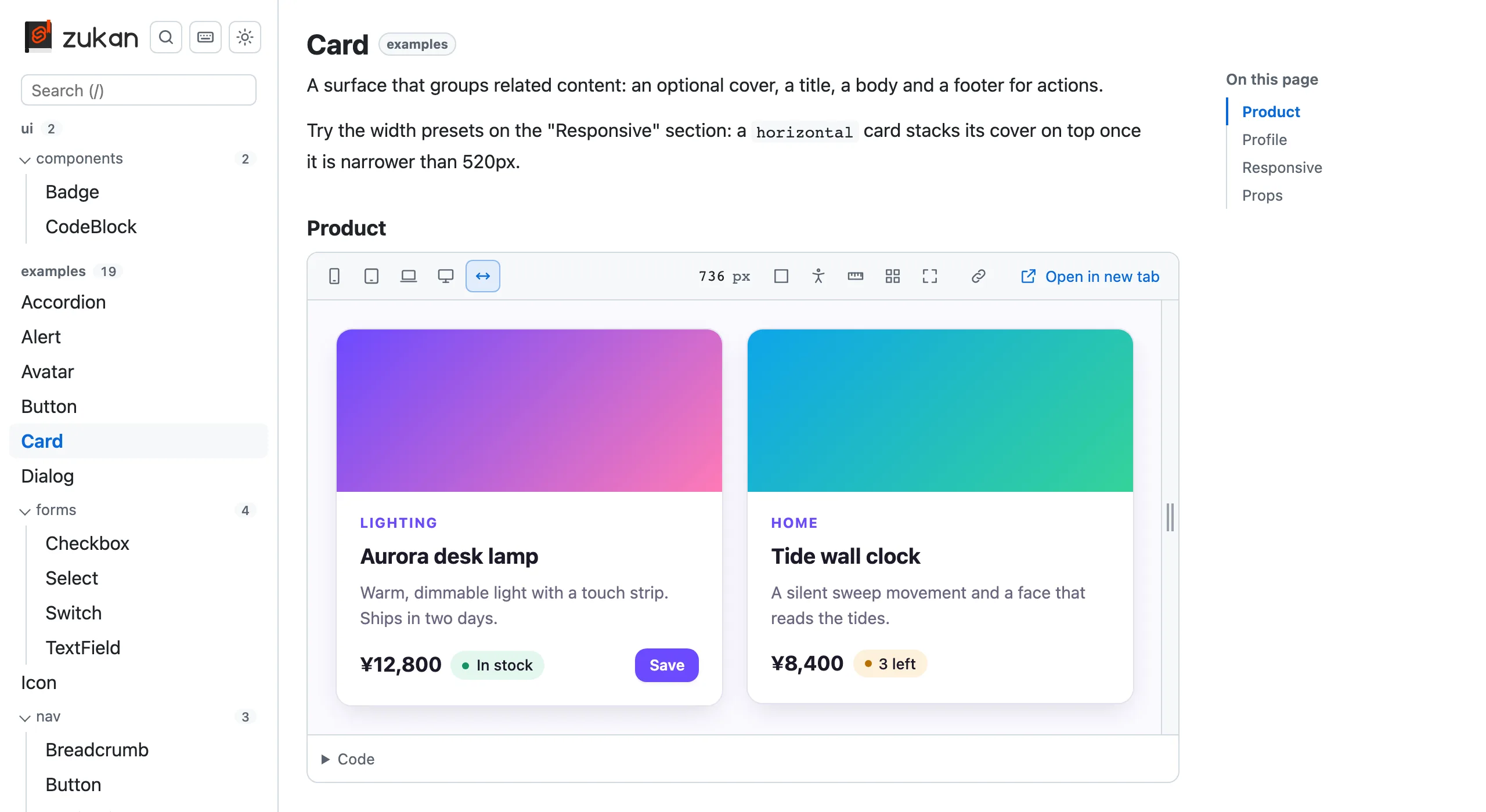
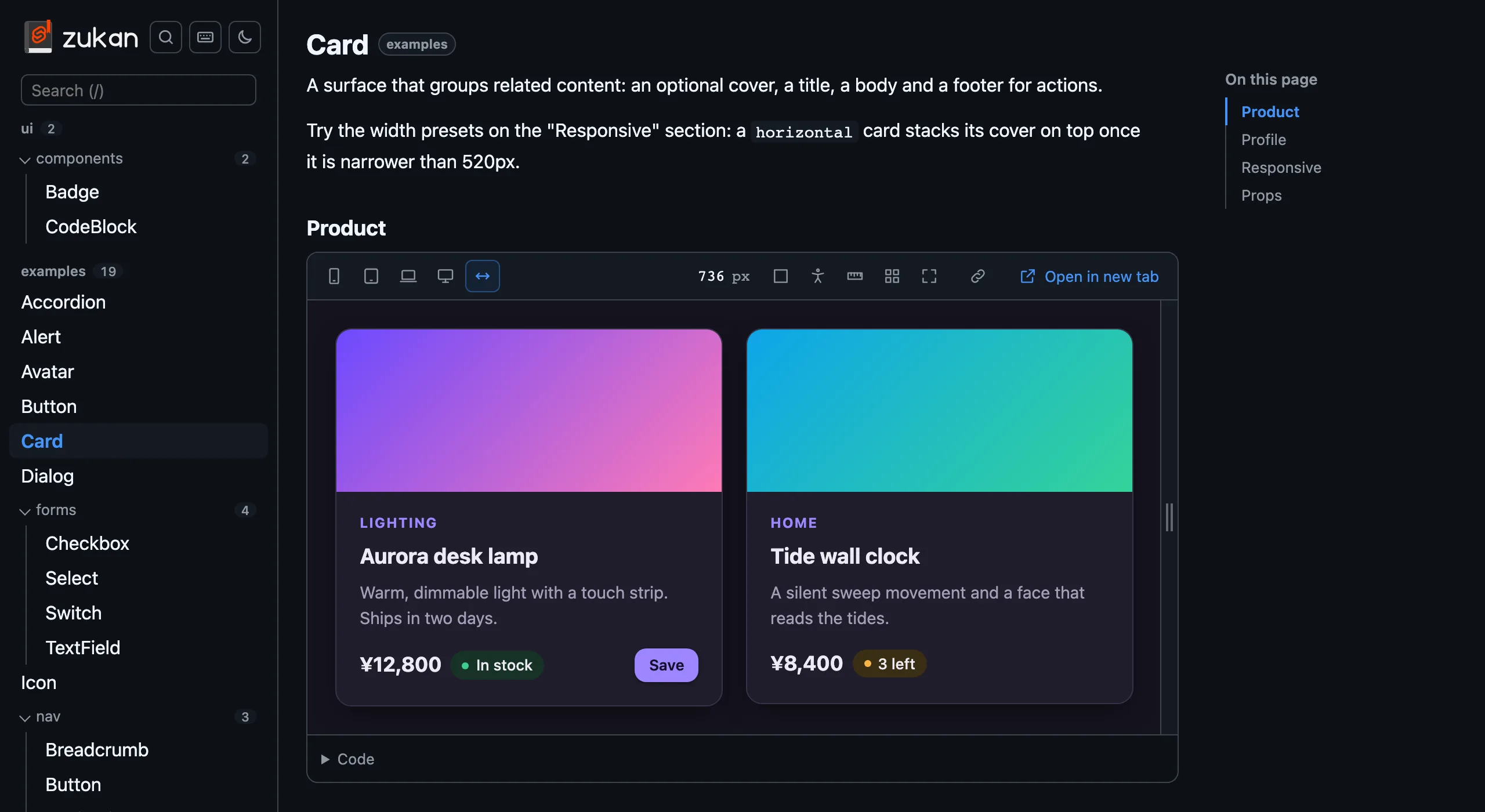 **One line in vite.config.ts**
Add `zukan()` to your Vite plugins. No routes or config files in `src`.
**Next to your components**
Put `Button.zukan.svelte` and `Button.zukan.md` next to `Button.svelte` and they show up in the catalog.
**Preview and code**
Each section previews in a resizable iframe, and its code is shown with the variables it uses.
**Props and accessibility**
A props table read from the component, and axe-core checks with outlined issues and vision simulation.
**Phone to desktop widths**
Presets from 375px to 1280px. Narrow widths are centered, wide ones scaled to fit your screen.
**Static export**
With `build: true`, `vite build` also writes a static catalog that works under any subpath.
## Let your AI agent write the catalog
Install the [agent skills](/svelte-zukan/skills) and ask Claude Code, Cursor, Codex or another agent to "set up svelte-zukan and catalog our components". It adds the plugin with the options your project needs, writes a catalog file for each component, documents its props with JSDoc and a `.zukan.md` file, and checks the result.
```sh
npx skills add oekazuma/svelte-zukan
```
**[Get started](/svelte-zukan/quickstart)**
Install svelte-zukan and write your first catalog file.
**[Why svelte-zukan](/svelte-zukan/why)**
What it focuses on, how it compares with Storybook, and when Storybook is the better pick.
**[See the demo](https://oekazuma.github.io/svelte-zukan/demo/)**
The catalog of svelte-zukan's own components, exported with `build: true`.
**[View on GitHub](https://github.com/oekazuma/svelte-zukan)**
Browse the source, open issues, and contribute.
svelte-zukan is not an official Svelte project (not affiliated with or endorsed by the Svelte team). The S shape in the logo is derived from the Svelte logo.
---
# Accessibility panel
Source: https://oekazuma.github.io/svelte-zukan/accessibility
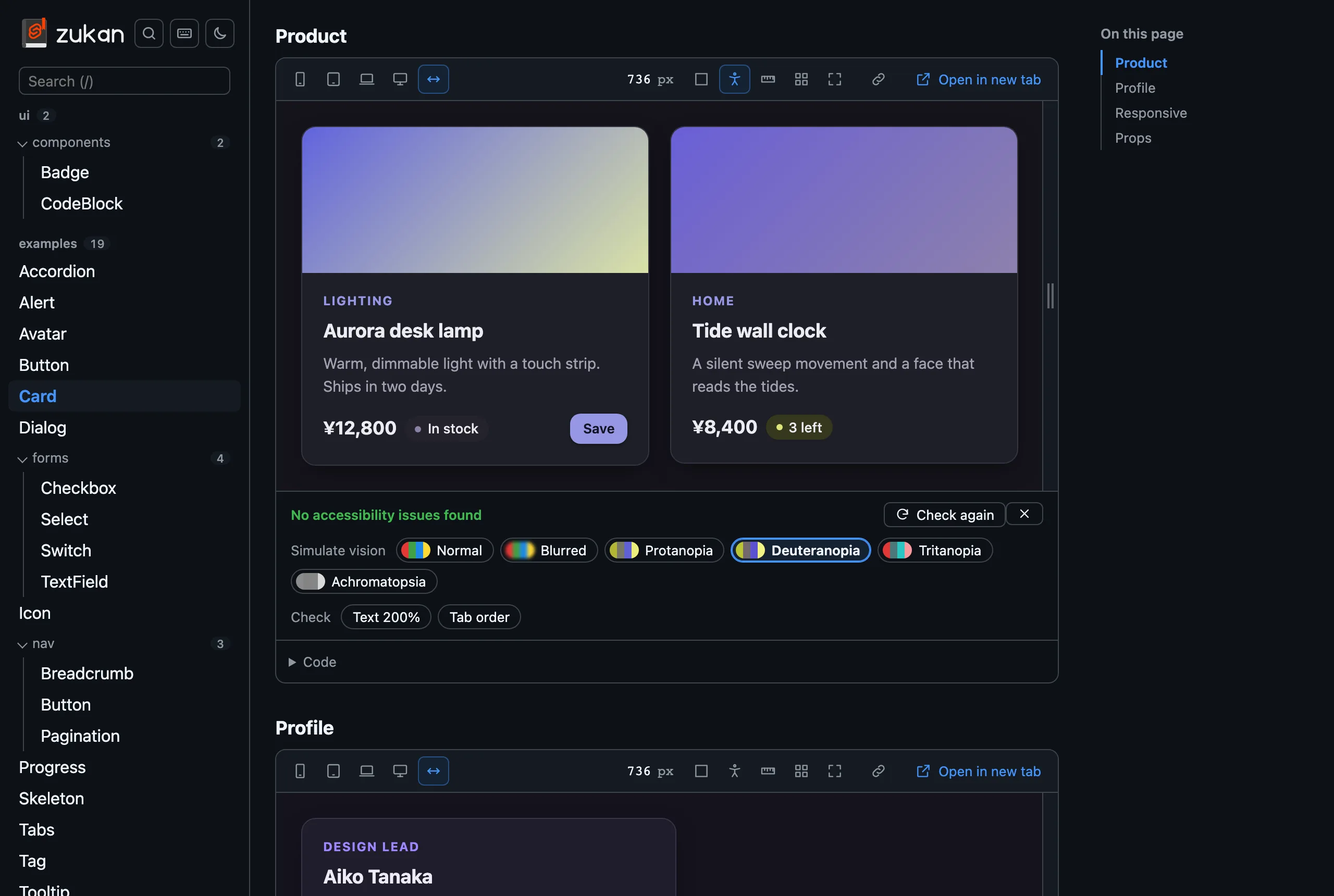
The accessibility button runs [axe-core](https://github.com/dequelabs/axe-core) inside the preview and lists what it reports: the impact, a description, a link to learn more, and the elements involved.
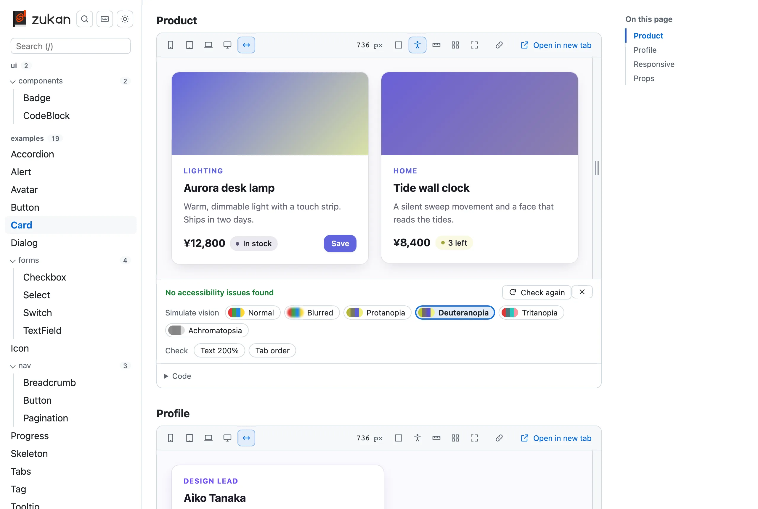
 - The reported elements are outlined in the preview in the color of their impact. Hover or focus an element in the list to draw it thicker, or click it to keep it that way and scroll to it. An element inside a shadow root is listed as its host's selector, `>>>`, then its selector inside
- What axe-core cannot decide on its own, such as the contrast of text over an image or a gradient, is listed separately under "Needs a manual check" and outlined with a dashed line. Read about each rule (Learn more) and check it yourself: some are visual, such as contrast, and some are not, such as an ARIA attribute. When nothing else is found, the panel says so instead of reporting no issues
- The check runs again after each edit while the panel is open, whether the preview reloads or the edit is applied in place, and after a theme switch or a width change
- "Simulate vision" shows the preview as seen with blurred vision or a color vision deficiency (protanopia, deuteranopia, tritanopia, achromatopsia). Each chip shows a sample of its colors
- "Check" has two switches for what axe-core cannot see:
- "Text 200%" doubles the root font size of the preview, as raising the browser's default font size does, so text that overflows or overlaps shows up. Text with a fixed `px` size does not grow, which is worth fixing too ([WCAG 1.4.4](https://www.w3.org/WAI/WCAG22/Understanding/resize-text.html))
- "Tab order" numbers the elements the Tab key moves to, in that order, and numbers them again when the preview changes. Elements inside a shadow root or an iframe are left out
- The vision simulation and both switches go back to off when the panel closes or the preview reloads
- With `locale: 'ja'`, axe-core's messages are in Japanese too
- A section that fails to load, or whose component throws while rendering, is reported as the error instead of being checked
axe-core is loaded only when a check runs, as a script file of the catalog (`/__zukan/axe.js` on the dev server, a file under `_zukan/` in the [static export](/svelte-zukan/static-export)), so a Content-Security-Policy of `script-src 'self'` allows it. The rule about landmarks around all page content is off, since a component on its own has none.
---
# Using it with AI agents
Source: https://oekazuma.github.io/svelte-zukan/ai-agents
An AI coding agent can set up svelte-zukan, write catalog files and check them without a browser. The quickest way to get there is the [agent skills](/svelte-zukan/skills). svelte-zukan also gives an agent these docs as text and the catalog as data (also as WebMCP tools in the browser).
## The skills
svelte-zukan ships two agent skills: `svelte-zukan`, to set svelte-zukan up and to write, document and check catalog files, and `migrate-svelte-zukan`, to move a catalog from Storybook or Histoire. [Agent skills](/svelte-zukan/skills) describes each one and how to install them.
## The docs as text
- [`llms.txt`](https://oekazuma.github.io/svelte-zukan/llms.txt) lists the pages, and [`llms-full.txt`](https://oekazuma.github.io/svelte-zukan/llms-full.txt) has all of them in one file
- Every page is also available as Markdown: add `.md` to its URL, as in `https://oekazuma.github.io/svelte-zukan/quickstart.md`
## The catalog as data
The dev server serves `/__zukan/catalog.json`, and `vite build` with `build: true` writes the same data to `catalog.json` next to `index.html`. Paths in it are relative to Vite's root. When the catalog can not be listed (a duplicate ID), the dev server answers with status 500 and `{ "error": "
 `)は書き換えられません。ホストのルートを指すので、カタログのホストがそのファイルを `/bg.png` で配信しているときにしか読み込めません。ファイルを import してください
- `build` を有効にすると、`vite build` は Vite の builder モード(Environment API)で動き、全環境が 1 回の実行でビルドされます
- カタログの CSS はアプリの `build.cssTarget` にかかわらず、`light-dark()` に対応したブラウザー(Chrome と Edge 123、Firefox 120、Safari 17.5)向けに出力します。そのため、コンポーネントの `light-dark()` もカタログのテーマボタンに従います
- `vite preview` でも、書き出したカタログを `/__zukan/`(`base` を設定していればその下)で開けるので、公開する前に確かめられます。`preview.headers` も送りますが、プレビューはどれも `index.html` のフレームなので、`index.html` では `X-Frame-Options: DENY` を `SAMEORIGIN` に変え、Content-Security-Policy の `frame-ancestors` に `'self'` を足します。カタログを公開するホストでも、同じオリジンのフレームを許可してください
- 再デプロイの前から開いたままのカタログのタブは、前のビルドのファイルを読みにいきます。そのファイルがもう無いときは、カタログを 1 回だけ読み込み直して新しいビルドに切り替えます(10 秒に 1 回まで。それ以上はプレビューにエラーを表示します)
- `vite build --watch` ではカタログを書き出しません。警告を出して飛ばします
- Vite の設定が `build.write: false` のときは、カタログをビルドしますが、ファイルの書き出しも削除もしません
- 出力先は Vite の root そのものや root を含むディレクトリにできません。アプリの `build.outDir`(既定は `dist`)、カタログ以外の各環境の `build.outDir`、SvelteKit の `outDir`(`.svelte-kit`)と重なってもいけません。アプリの `publicDir`(`public`、SvelteKit では `static`)の中にも置けません。アプリはカタログを書き出す前に `publicDir` をコピーするからです。どれもビルドエラーになります
- カタログを書き出すのは `vite build`(Vite の JavaScript API なら `createBuilder().buildApp()`)です。`vite build --ssr` と Vite の `build()` 関数は 1 つの環境だけをビルドするので、カタログは書き出しません
- `index.html` の隣に `catalog.json` も書き出します。全コンポーネントのセクション、コード、props、`.md` と、カタログファイルのない `.svelte` ファイルをまとめたもので、ツールや AI エージェント向けです。dev サーバーでは同じ内容を `/__zukan/catalog.json` で返します
- 書き出しの前に、前回のカタログ(出力先の `_zukan/`、`index.html`、`catalog.json`)だけを消します。SvelteKit では、adapter が `build/` を空にすることが多いので、出力先が `build/` と重なると警告を出します
[デモ](https://oekazuma.github.io/svelte-zukan/demo/ja/)は svelte-zukan 自身のコンポーネントのカタログをこの方法で書き出したものです。
---
# SvelteKit の機能を使う
Source: https://oekazuma.github.io/svelte-zukan/ja/sveltekit
svelte-zukan は `$app/state` や `$app/navigation` のような SvelteKit の実行時 API を差し替えず、モックもしません。カタログの中では SvelteKit の実行時コードが既定の状態で動きます。
- `$app/state` の `page`: `url.pathname` は空文字、`params` は `{}`、`data` は `{}`
- `$app/env` の `browser`: `true`
- `$app/navigation` の `goto` など: reject するだけで、画面は移動しません
- `$app/paths` の `resolve`: アプリの `paths.base` を前提にした URL を返します(`paths.base` が空なら `resolve('/')` は `/`)。カタログ自身の URL ではありません
- `$app/paths` の `asset`: `resolve` と同じく、アプリの `paths.base` を前提にした URL を返します(例: `asset('favicon.svg')` は `/favicon.svg`)。`paths.assets` はカタログの中では使われません。カタログの中でアプリの `static/` のファイルを読むと、アプリの dev サーバーが配信するものが使われます
- `$app/manifest` の `assets`、`immutable`、`prerendered`、`routes`: dev では SvelteKit の dev サーバーが返す値、静的に書き出したカタログでは空の配列
- `$app/env/public`(または `$env/dynamic/public`)の動的な公開環境変数: dev でも静的な書き出しでも `undefined`。値を受け取るのは SvelteKit が描画したページだけで、カタログはそれに当たりません。静的な変数は値を保ちます
現在のページに応じて表示が変わるナビゲーションなどのコンポーネントは、カタログでは上の既定値のまま描画されます。上で触れたものを除き、静的に書き出したカタログでも同じです。
---
# Tailwind CSS のトークン
Source: https://oekazuma.github.io/svelte-zukan/ja/tailwind
アプリが Tailwind CSS v4 を使っているときは、コンポーネントの土台になっているテーマをカタログで見られます。色、スペーシング、文字、角丸、影などを、それぞれのクラスと実際の見た目のサンプルつきで一覧にします。`bg-brand-500` や `p-4` があるか、どう見えるかを確かめるのに使えます。設定は要りません。
## ページが表示される条件
次の 2 つがそろうと、サイドバーのコンポーネントの下に「Tailwind CSS」のリンクが現れ、カタログのトップページにはエントリーごとのカードが並びます。
- **Tailwind CSS 4.1.0 以降と、そのビルド用の連携パッケージが入っている。** `@tailwindcss/vite`、`@tailwindcss/postcss`、`@tailwindcss/cli` のどれかです。svelte-zukan はアプリの CSS をビルドするのと同じ Tailwind を読み込むので、カタログとアプリで内容がずれません。探す場所は、エントリーのあるフォルダーとその親フォルダーの `node_modules`、そのあとで Vite の root の `node_modules` です
- **Tailwind CSS のエントリーがある。** `@import "tailwindcss"`(または `tailwindcss/…` の import)を持つか、`@theme` を持つか、そのようなファイルを直接またはほかの CSS ファイルを経由して import している CSS ファイル(どのプラットフォームでも、名前が小文字の `.css` で終わるもの)です。探すのは、svelte-zukan がカタログファイルを探すディレクトリ([`groups`](/svelte-zukan/ja/options) と[モノレポ](/svelte-zukan/ja/monorepo)を参照)と、Vite の root の `src` です。`groups` に含まれていなくても root の `src` は探します。SvelteKit のアプリは `src/app.css` を置き、`groups` は `src/lib` を指すのがふつうだからです
別のエントリーから直接、またはほかの CSS ファイルを経由して import されている CSS ファイルは、エントリーではなく部品として扱います。たとえば `@import "./tw.css"` と `@import "./tokens.css"` だけを書いた `app.css` があれば、エントリーは `app.css` で、両方のトークンが並びます。同じ部品を import する 2 つのファイルは、2 つのエントリーのままです。`@reference` は import に数えません。`reference` を付けた `@import`(`@import "tailwindcss" reference`、`@import "../app.css" reference`)も同じです。ファイルを `theme(reference)` を付けて import しているだけのファイルも、エントリーになりません。import しているだけのファイルがエントリーになるのは、そのファイルのフォルダーか Vite の root から Tailwind が見つかるときに限ります。
`@theme` はあっても `@import "tailwindcss"` がないファイルは、先頭に `@import "tailwindcss";` を足して読み込みます。ほかのエントリーと同じように、Tailwind の既定値と、そのファイルのトークンが並びます。エントリーが複数あるときは、Vite の root からの相対パスを添えたリンクがエントリーごとにできます。
Tailwind が入っていない場合や Tailwind CSS v3 の場合は、ページも警告も出ず、負担もありません。4.0.x を使っているプロジェクトでは、ページにアップグレードを促すエラーが出ます([エラー](#エラー)を参照)。
ページに並ぶのは、エントリーから Tailwind が解決できるすべてです。既定値、`@theme` で追加・上書きしたもの、`@plugin` と `@config` が読み込むものが入ります。import はアプリのビルドと同じ方法で解決するので、`$lib/theme.css` のようなエイリアスも使えます。
## カード
トップページのコンポーネントの上に、エントリーごとのカードが並びます。テーマの色を並べた帯、エントリーのファイルと Tailwind のバージョン、トークンとテーマ変数の数を載せています。パディングとスペーシングの `p-4` のように 2 つのカテゴリーに載るトークンは、1 つと数えます。クリックするとページを開きます。
## ページの見方
カテゴリーは左側のリストに並びます。「色」「余白とサイズ」「文字」「枠線と角丸」「効果」「レイアウト」のグループに分かれ、そのあとに「すべてのテーマ変数」が続きます。それぞれにトークンの数が付きます。幅が狭いページでは、リストがトークンの上のセレクトに変わります。カテゴリーを選んでいないときは、リストの先頭のカテゴリーが開きます。
色はテーマの順に並びます。既定のカラーパレットが Tailwind の順で並び、そのあとにプロジェクト独自の色(フィルターで探せます)、最後に `current`、`inherit`、`transparent` が来ます。ほかのカテゴリーは値の小さいほうから大きいほうへ並ぶので、プロジェクト独自のサイズも既定のサイズのあいだに入ります。ゼロの値や `none` が先頭、`rounded-full` が末尾です。値はブラウザーを使わずに計算し、`1rem` と `1em` は 16px、単位のない行の高さは 16px の倍数として扱います。`auto`、`100%`、`100vw`、シャドウ、フォントの並びのように、この方法で比べられない値は、ほかの値のあとに来ます。値が同じトークンと、比べられないトークンは、テーマの順のままです。カテゴリーは次のとおりです。
| カテゴリー | クラス |
| -------------------------------------------------- | ------------------------------------- |
| 背景色、文字色、枠線の色 | `bg-*` `text-*` `border-*` |
| パディング、マージン | `p-*` `m-*` |
| フォントサイズ、フォントの太さ、フォントファミリー | `text-*` `font-*` |
| 文字間隔、行の高さ | `tracking-*` `leading-*` |
| ドロップシャドウ、ボックスシャドウ | `drop-shadow-*` `shadow-*` |
| 角丸、枠線の太さ、不透明度 | `rounded-*` `border-*` `opacity-*` |
| 幅、高さ、重なり順(z-index) | `w-*` `h-*` `z-*` |
| ブレークポイント | `--breakpoint-*` の変数 |
| スペーシング | `--spacing` の基準値と `p-*` のクラス |
トークンのないカテゴリーは表示しません。「すべてのテーマ変数」では、テーマ変数と宣言された値を、名前空間(`--color-*`、`--spacing`、`--radius-*` など。どれにも当てはまらないものは「その他」)ごとの見出しと表で見られます。色の値にはスウォッチが付き、変数名にはコピーボタンがあります。
トークンには、実際のサンプル、クラス名、CSS 変数、解決した値が載ります。サイズには計算後の px も付きます(`p-4` なら `calc(0.25rem * 4) · 16px`)。テーマの値に `--spacing(6)`、`--alpha()`、`theme(--radius-lg)` などの Tailwind の CSS 関数を使っているときは、Tailwind が書き出す値(`calc(0.25rem * 6)`)を表示します。color-mix は、フォールバックではなく、対応するブラウザー向けに Tailwind が書き出す値を表示します。Full config も、表示するクラスが読む変数については同じです。それ以外の変数、たとえば `--blur-card: --spacing(2)`、`--ease-*`、`--animate-*`、`--aspect-*`、クラスに値がコピーされる `--shadow-*` は、Tailwind がこの形で書き出さないので、Full config には書かれたままの値が載ります。`@theme inline` の変数も `static` を合わせて指定しない限り Tailwind が書き出さないので、Full config には書かれたままの値が載ります。`@theme inline static` なら、Tailwind が書き出す値が載ります。`@theme { --color-brand: #f00 }` に対する `:root { --color-brand: #00f }` のように CSS がテーマ変数を上書きしているときは、トークンにはカスケードで勝つ値(`#00f`)が載り、Full config と `catalog.json` の `variables` には宣言されたテーマの値(`#f00`)が載ります。テーマが定義していない `var()` は、フォールバックがあればその値で表示し(シャドウなら `0 4px 6px -1px rgb(0 0 0 / 0.1), …`)、なければ書かれたままで表示します。値が空のときは `none` と表示します。クラス名と変数名にはそれぞれコピーボタンがあります。Tailwind に `prefix` を設定しているときは、クラス名にも付きます(`tw:bg-brand-500`)。ブレークポイントとスペーシングの基準値はクラスではないので、変数だけを表示します。変数が表示されるのは、クラスが変数を読んでいるときと、`@theme inline` のトークンで、クラスの値のもとになった変数があるときです。`--color-primary: var(--color-blue-500)` のように、`@theme inline` でほかのテーマ変数を参照しているトークンは、参照先ではなく自身の変数(`--color-primary`)を表示します。ユーティリティが複数の名前空間を読むときは、Tailwind と同じく、クラス名に一致する最初の名前空間が使われます。`--color-primary` と `--text-color-primary` があれば `text-primary` は `--text-color-primary` を、`--spacing-card` と `--padding-card` があれば `p-card` は `--padding-card` を表示します。`@theme reference` の変数や、`@plugin` と `@config` が読み込む変数は、Tailwind が CSS に書き出さないのでコピーするものがなく、トークンには表示しません。ただし、クラスが読む変数を CSS やプラグインが `:root` で宣言しているときは表示します。`inline` なしの `@theme reference` の変数と、daisyUI の `base-100: var(--color-base-100)` のように自身の変数を `var()` で参照するプラグインの値がこれにあたります。Full config には、どれも値とともに載ります。
- **絞り込み**: トークンの上の入力欄に打った文字を、クラス名・変数名・値のどれかに含むトークンだけを残します。「すべてのテーマ変数」では変数名と値で絞り込みます。入力した文字はアドレスの `q`(`#/tailwind?source=…&category=…&q=…`)に保たれるので、再読み込みしたり、リンクを共有したりしても同じトークンが表示されます。入力中は履歴を増やさず、今の履歴を置き換えます。カテゴリーを切り替えても絞り込みは残ります。絞り込んでいる間は、カテゴリー一覧の数が一致したトークンの数になり、一致のないカテゴリーは薄く表示されます
- **サンプルテキスト**: 文字に関するカテゴリー(文字色、フォントサイズ、フォントの太さ、フォントファミリー、文字間隔、行の高さ)では、サンプルに表示する文字を入力できます
1 つのトークンに載せるクラスは 1 つだけで、そのトークンを使うすべてのユーティリティは並べません。たとえば色は `bg-*`、`text-*`、`border-*` だけで、`ring-*` や `fill-*` などは含みません。
### サンプルの描画
背景色、文字色、文字のカテゴリーはカードで表示します。文字色のサンプルは、白に近いトークンも見えるように、明るい帯と暗い帯の両方に文字を描きます。シャドウもカードで、グレーのパネルの上に描きます。枠線の色とサイズのカテゴリー(パディング、マージン、スペーシング、幅、高さ、枠線の太さ、角丸、不透明度、ブレークポイント、重なり順)は 1 行ずつのコンパクトな表示で、見比べやすくしています。
- **パディングとマージン**: ブロックのまわりの余白を描きます
- **幅、高さ、スペーシング**: 実際の大きさのバーを描きます。行より長いバーは、端が薄れて消えます。`100%` や `100vh` のようにフレームに合わせて決まる値には、バーがありません
- **枠線の色**: そのトークンの色の太い枠線を付けた白い箱を描きます
- **ブレークポイント**: 幅に比例したバーを描きます。px は、メディアクエリと同じくブラウザーの初期フォントサイズ 16px で計算し、CSS がページに指定したフォントサイズには左右されません
- **重なり順(z-index)**: サンプルはなく、名前と値だけを表示します
サンプルは、専用のフレームの中に描きます。フレームには、Tailwind がそのエントリーから生成した CSS(テーマ変数、エントリー自身のルール、preflight)を入れています。`tailwindcss/theme.css` のように Tailwind のファイルの一部だけを import するエントリーでは、サンプル用に Tailwind のユーティリティを加えます。カタログのスタイルがサンプルに影響することはないので、サンプルの文字はテーマの `--font-sans` など、アプリの `html` と同じフォントで描きます。また、Tailwind の CSS がカタログやコンポーネントのプレビューに漏れることもありません。
表示する値は基本の値なので、フレームはどのカタログのテーマでも常にライトです。フレームの外のページは、カタログのテーマに従います。ただし、Full config、トップページのカード、検索の色見本はライトで描きます。
## 表示しないもの
- **ダークモードの値。** `.dark { … }` や `@custom-variant dark` は読まないので、トークンの値は 1 つです
- **任意の値とバリアント。** `p-[13px]`、`hover:`、`md:` は載せません。`flex` のようにテーマの値を取らないユーティリティも載せません
- **相対パスの `@font-face` と `@import url()`。** サンプルはカタログの中のフレームで描くので、CSS ファイルからの相対パスで書いた `url()` は解決できません。フォントファミリーのサンプルが、システムのフォントに置き換わることがあります。Web フォントの `@import url("https://…")` のような絶対 URL か、インストール済みのフォントなら表示できます
- **Tailwind CSS v3**、および v4 のエントリーがない `tailwind.config.js` だけの構成
## 開発中の動き
データは、ページ、[`catalog.json`](/svelte-zukan/ja/ai-agents#データとしてのカタログ)、静的ビルドのいずれかが最初に必要としたときに生成します。dev サーバーの起動時には作りません。Tailwind CSS のエントリーがないプロジェクトでは、何も生成しません。
dev サーバーでは、エントリー、その import 先、プラグイン、設定ファイルが変わったとき、そして探索するディレクトリで `.css` ファイルが作られたり削除されたりしたときに、ページを更新します。トークンやサンプルが実際に変わったときだけ、カタログのタブを再読み込みします。アプリ自身の CSS の更新はそのまま動き、アプリのタブが再読み込みされることはありません。
次の 2 つの場合は、手を加える必要があります。
- **最初のエントリー。** dev サーバーを起動したときに Tailwind CSS のエントリーがなかった場合、あとからエントリーを作ってもページは現れません。dev サーバーを再起動してください。
- **あとから作った import 先。** エントリーの `@import` が、まだ存在しなかったファイルを指していたときに、探索するディレクトリの外でそのファイルを作っても、ページは自動では更新されません。エントリーを保存し直すと読み直します。
[`build: true`](/svelte-zukan/ja/static-export) にすると、静的に書き出したカタログにもこのページが入り、`catalog.json` にもデータが入ります。Tailwind を使わないプロジェクトでは、出力にファイルが増えません。
## エラー
読み込みに失敗したエントリーは、そのページにエラーを表示します。カタログのほかの部分は引き続き動きます。`vite build` では、ビルドを失敗させず警告にします。同じメッセージは `catalog.json` のそのエントリーの `error` にも入ります。
| メッセージ | 対処 |
| ------------------------------------------------------------------------------------- | ---------------------------------------------------------------------------------------------------- |
| `Tailwind CSS